This article is an excerpt from The Dramatic Portrait by Chris Knight.
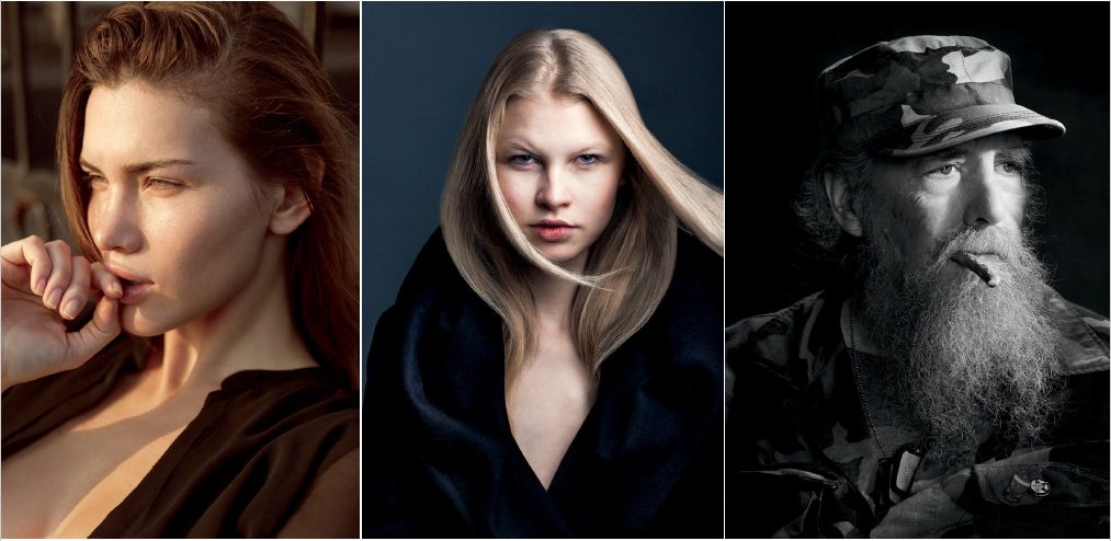
Whether one is shooting in a studio or on location, the space behind the subject cannot be ignored. Without getting too heavy on composition here, the main touchstone is the concept of “figure/ground”, with the main goal of separating the subject from the background. In a two-dimensional image, this is a way to create depth and help with visual organization. This can be done through depth of field, contrast, framing of the subject within the environment (also usually through contrast), and lighting (Figure 1).
DEPTH OF FIELD: Through depth of field, the subject is in focus and the background lacks focus by varying degrees. This can work particularly well when the background has no relation to the subject, does not add any additional context, or is too distracting. Another by-product of very wide apertures is the soft edges of the subject, which can be reminiscent of paintings, where the detail decreases away from the face and large brush strokes are more apparent, making the edges of the subject appear “fuzzy.”

1 In the first image, the background is busy and is in a similar color palette, so a shallow depth of field is used to help separate the subject from the background. In the second image, the subject is much lighter than the dark background. The clothes are subtly darker than the background, creating a separation, but the combination of low-key tones from the wardrobe and background help reinforce the focus on the subject’s face. The last image utilizes a rim light (high and behind the subject) to separate the subject in an otherwise dark scene
CONTRAST: Using contrast, bright subjects pop out from dark backgrounds (or dark parts of the background) and dark subjects do the same on a bright background. Using this method utilizes a more refined compositional eye than simply throwing the background out of focus and, when the background adds meaning to the subject, results in a stronger image than simply using a wide aperture. This can be done using a studio background or an environment, but the concept remains the same—dark subject on light, light subject on dark.
LIGHTING: A third option is lighting. A rim or background light helps to create separation of the subject from the background. Either light (or both at once) can be utilized, but they will have the same overall result—creating separation. Of course, an obvious separation is not even entirely necessary. Using very little tonal differences between the subject and background was a common device used by painters through the centuries. Dark clothes on dark backgrounds (with little to no separation) was often a way to instruct the viewer where to look—the face. This approach requires more control over low-key tones and obliges the viewer to pay closer attention to the image to absorb what the artist set out to show. When utilizing no separation, the subject emerges from the shadows with no clear definition to his edges. No method is more correct than another, and through enough testing, you can decide your preferred method. But pick one and make it on purpose.
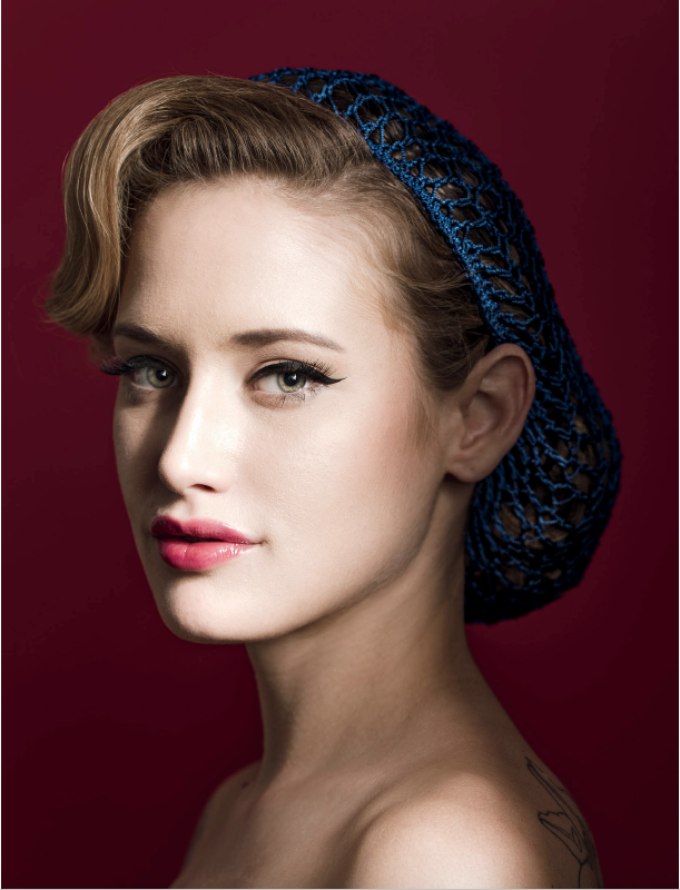
ENVIRONMENT VERSUS STUDIO: Using an environment creates its own share of opportunities and challenges. First, there is ample possibility for a visual feast. Environments are dynamic and add dimension to a portrait. They are also sometimes difficult and unpredictable to work in for many other reasons. When shooting portraits in an environment, it is crucial to remember that the subject is the most important part of the image and the environment should not overwhelm him or her. A strong portrait has a clearly defined subject. The environment helps to frame the subject, add context, or both. It may also require additional lighting (but it may not). In the studio, some may think that backgrounds are simple and boring. This is not the case at all. It is true that in the studio there is nowhere to hide (you control nearly every component of the visual image and failures and successes are on full display), but there are still many options available for interesting backgrounds. The most common (and inexpensive) method is a roll of seamless paper (Figure 2). These come in a variety of colors and widths and are relatively cost-effective. As the name suggests, there is no seam—meaning it is meant to appear as a void behind the subject. Lights and gels can be used to modify the paper’s appearance. Seamless backdrops can make for a bold, graphic background behind the subject. Similar to seamless (but at the other end of the cost spectrum) is the cyclorama (or “cyc”). This looks close to seamless in a photo, but is constructed out of plywood (which makes it heavy and hard to move) and painted the desired color. A cyc does not get wrinkled or creased like paper and the subject can utilize it as an interactive element if needed.
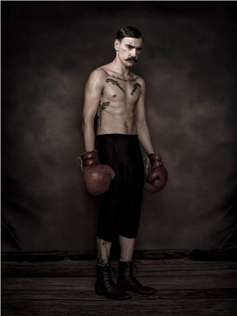
A step up from seamless paper—and easier to maneuver than a cyc—is the printed backdrop (Figure 3). Like rolls of paper, they come in a variety of sizes, and unlike paper, they are available in a much wider range of colors, textures, and materials. They come in an assortment of styles and even scenes (both painted and photo) to fulfill any need. In addition to backgrounds, roll up mats with different floor textures can be used to easily and cheaply change out floors. Both are viable options to maintain different, inter-changeable sets. Lastly, there is the painted canvas backdrop (Figure 4). This option is more expensive than the printed option, because these backgrounds are not mass-produced but are created by hand. Backgrounds like these are seen in the work of Annie Leibovitz, Norman Jean Roy, and Patrick Demarchelier. A printed background is typically used one way (as a background), but a canvas backdrop is more versatile and is regularly used as a compositional device within the greater image for added effect and depth. When there is the option of shooting in studio or with an environment, consider that sometimes stripping away context (the environment) adds more focus and meaning to the individual, but other times, the environment adds more to the overall narrative.

3 The background (a wrinkle-free polyester that can be put in a washing machine) and floor (a neoprene rubber mat) are both printed. Courtesy of Denny Manufacturing.

4 A canvas backdrop creates a unique, textured background for the subject
