This excerpt is from Chapter 9, Eliminate Processing Artifacts from the book from the book Crafting the Landscape Photograph with Lightroom Classic and Photoshop by Ben Willmore. In this excerpt Willmore walks through how to correct common over editing issues and object halos using Adobe Lightroom and Photoshop. There are hundreds of adjustment, masking and retouching techniques that have the potential to radically transform an image. Though they are generally useful, many of these choices tend to produce undesirable side effects that may not become apparent until you zoom in closely inspect an image. If the presentation of your photographs is limited to social media, where images are presented at a small size, then many of the techniques in this chapter may not be needed. If, on the other hand, you plan to make large prints that may be inspected closely, then you’ll likely want to study the techniques that follow and incorporate them into your daily workflow.
Over-Editing
Many of the adjustment sliders in Lightroom have a practical limit on how far they can be pushed before the quality of the resulting image starts to be compromised. Let’s explore the most common issues you may encounter from over-editing an image and why it can occasionally be desirable.
Blown-Out Highlights
Moving the Exposure, Highlights, or Whites sliders to the right can potentially cause the brightest area of an image to be rendered as solid white. This is often referred to as “blowing out the highlights” because it causes areas that originally contained detail to be rendered with no detail whatsoever.
The right half has been adjusted to ensure that the brightest area is rendered as solid white, which helps make the light source appear extremely bright.
Blown-Out Light Sources
Light sources look great when rendered as solid white since it makes them appear radically brighter than anything else in the scene.
Water and other shiny surfaces may reflect light sources to produce what is commonly referred to as specular highlights, which also looks great as small areas of solid white. That’s why waterfalls can benefit from pushing the Whites slider high enough to cause tiny areas to be rendered as solid white–it makes the water appear to be shiny.
Blow-Out to Simplify
I often blow out the highlights to render a sky as solid white in an effort to simplify an image. That way, I can present darker areas on a solid-white backdrop instead of showing detail across the entire image.
Unintentionally Blown Highlights
I always try to make it a conscious choice to blow out the highlights or render them with detail. If you’re not careful, you can easily blow out the highlights unintentionally any time you boost the Exposure, Highlights, or Whites sliders. I use the following concepts when I want to ensure that the brightest area of an image retains detail.
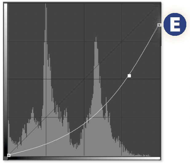
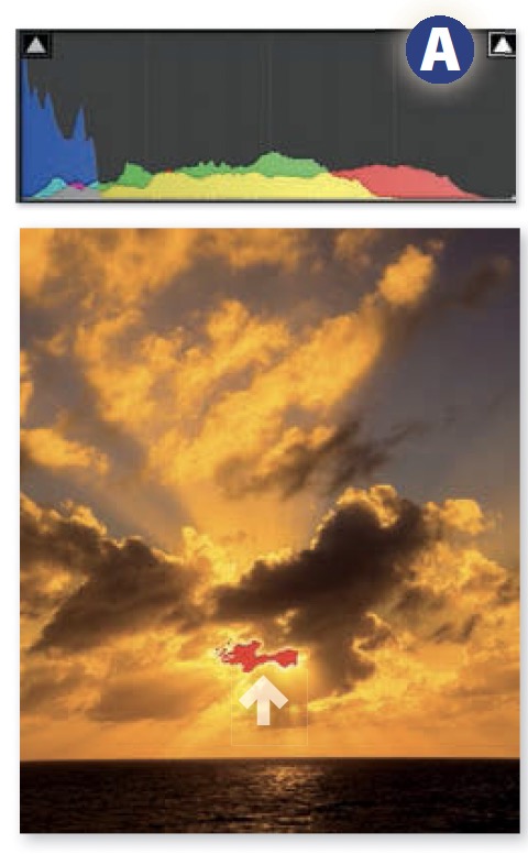
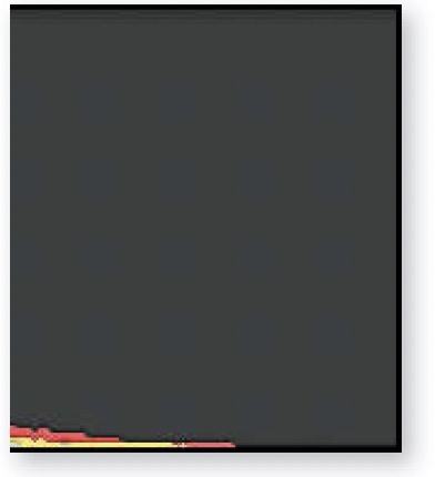
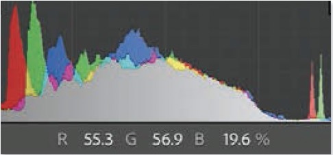
Monitor the Histogram: The rightmost bar on the histogram represents the brightest area contained within an image. The position of that bar relative to the right edge of the histogram panel indicates how close it is to becoming solid white.
When the histogram does not extend all the way to the right, then the size of the gap to the right of the histogram indicates how much the highlights could be brightened before they would start to blow out and lose detail. The larger the gap, the more leeway you have to further brighten the image without losing detail.
Behind the scenes, all images are made from varying amounts of red, green, and blue light. Because of this, there are three levels of potential detail loss depending on how many of those colors have reached their maximum brightness. The color of the rightmost bar indicates the extent of detail loss. A red, green, or blue bar indicates that only one of the three colors that make up the image is becoming blown out, while the other two colors still contain some hint of detail. A cyan, magenta, or yellow bar indicates that two out of the three colors are maxed out and therefore only one color contains any hint of detail. A white bar indicates that all three of the colors that make up the image are maxed out. Therefore, the brightest area has become solid white and contains no hint of detail whatsoever.
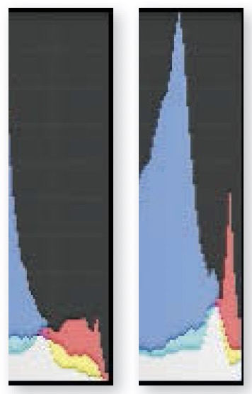
The height of the bar on the right edge of the histogram indicates how large of an area within the image is becoming blown out. That bar will usually be multi-colored with the white portion representing areas that are becoming solid white and the color representing other areas that are losing partial detail.
The histogram is a rather crude way to monitor what’s going on in an image. After all, any camera that is capable of producing a raw fi le will capture over 4,000 brightness levels from a scene, which are then represented in a bar chart that contains only 256 bars. High-resolution camera sensors capture many millions of pixels, which are then represented using bars that max out at around 100 pixels tall. That’s almost as bad as reproducing an image out of a few thousand LEGO® bricks that have a very limited palette of available colors. A histogram may represent your image, but it is not a very precise way of seeing what’s truly happening.
Clipping Indicators
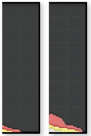
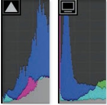
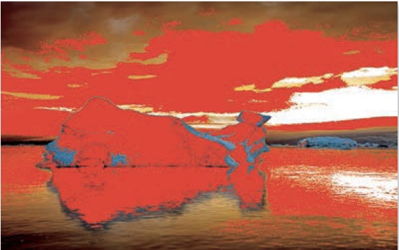
Clicking on the triangular icon found in the upper right of the histogram A will enable a feature known as the Clipping Indicators, which will cause a red overlay to appear anywhere within the image where solid white is found. This can be a good way to figure out if an adjustment is causing detail to be lost in the highlights of an image.
Clipping Display
The most precise, and therefore my personal favorite, method of determining if the Exposure, Highlights, or Whites sliders are causing detail loss in the brightness areas is to hold the Option key (Mac) or Alt key (PC) while moving any one of those sliders. This will change the appearance of the entire image to display black where there is detail in all three colors that make up the image behind the scenes. Color will be displayed where detail is being lost in one or two of the three colors that make up the image (the colors mean the same thing as they do in the histogram). White will be displayed where all three colors are being blown out and you therefore have solid white with no detail whatsoever.
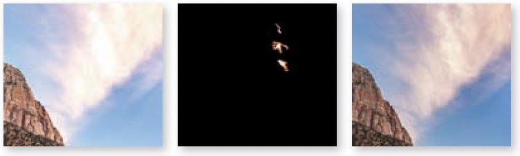
Middle: Clipping Display view showed precisely where detail was being lost.
Right: Result of reducing Whites to prevent blow-out highlights.
The options we’ve covered so far are specific to Lightroom. When working in Photoshop, you can substitute any of the following techniques.
Histogram Panel
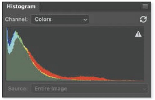
You can view a histogram in Photoshop by choosing Window>Histogram. To set it up in a similar fashion to the one found in Lightroom, choose Expanded View from the hamburger menu in the upper right and turn off the Show Statistics choice in the same menu. Finally, set the Channel pop-up menu above the histogram to Colors.
Levels Clipping Display
To produce a clipping display similar to what’s found in Lightroom, click on the topmost layer, choose Layer>New Adjustment Layer>Levels, hold Option (Mac) or Alt (PC), and click the upper-right slider.
Interactive Clipping Display
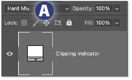
If you like the clipping indicator available in Levels and want it to become interactive so you can make changes on the underlying layers and see it update in real time, then try the following: With the top-most layer active, choose Layer>New Fill Layer>Solid Color, choose white when prompted, and then change the Blending Mode pop-up menu to Hard Mix A.
Threshold Layer
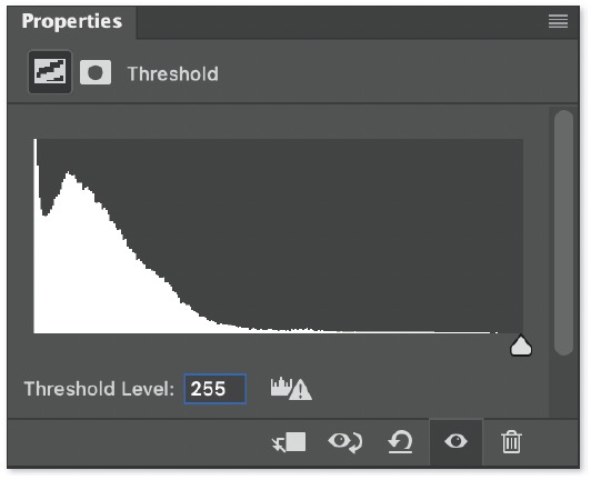
If the colors shown in the previous options are distracting, then choose Layer>New Adjustment Layer>Threshold and move the slider all the way to the right. This will display black where there is full detail and white where areas are blown out to solid white.
Clipped Shadow
Moving the Exposure, Shadows, or Blacks sliders to the left can potentially cause the darkest area of an image to be rendered as solid black. This is often referred to as “clipping” because the brightness levels in an image are recorded in a fi le as numbers that represent how much light is present. Once you hit zero (black) in one spot, any further darkening of the image “clips” o any variation in brightness to zero as areas get pushed to the minimum value and are not allowed to become any darker. The same is true on the bright end of the range where “blowing out the highlights” can also be described as “clipping the highlights” since they’ve reached their maximum value and can’t be pushed any further.
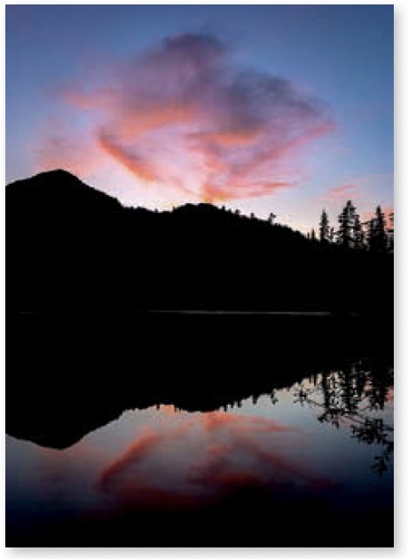
Silhouetted Objects
One way to simplify an image is to render the dark areas as solid black in an effort to produce a recognizable solid-black shape (such as a tree or animal) known as a silhouette. This is primarily useful when the subject that will become black is backlit by the sun. When that’s the case, it’s as easy as lowering the Blacks slider until you can no longer see detail in the area.
Consistent Shadow Density
If the absolute darkest area in a normal highcontrast image (as apposed to hazy, foggy, or highlight-heavy image) is not solid black, then the image will likely appear dull if viewed next to another image that does contain black. For this reason, I always try to ensure that a tiny area of most images is adjusted to become solid black. This can usually be accomplished by holding Shift and double-clicking on the Blacks slider. Doing so will cause Lightroom to automatically adjust the Blacks slider to ensure a tiny area becomes solid black.
Unintentionally Clipped Shadows
If you’re not careful, you can unintentionally clip the dark areas any time you lower the Exposure, Shadows, or Blacks sliders. The same controls that I covered earlier when discussing highlight detail in this chapter are also available to monitor clipping of the dark areas in an image. Here are a few differences between monitoring the status of the highlights and shadows:
■ When monitoring the histogram, inspect the far-left end, which represents the darkest area of the image. A histogram that does not extend all the way to the left edge of the histogram panel indicates that the image does not contain black.

■ Clicking the triangular icon in the upper left of the histogram will cause its outline to change from dark to bright, indicating the shadow Clipping Indicator has been enabled. This will cause a blue overlay to appear within the image where the shadows are clipped to zero. The triangular icon will also change in appearance. It will be dark gray when full detail is present in the darkest area. It will change to a color when one or two of the three colors that make up the image behind the scenes gets clipped. It will become a light shade of gray when all three colors are clipped and therefore the darkest area is solid black.
■ Holding Option (Mac) or Alt (PC) while moving the Shadows or Blacks sliders will invoke the Clipping Display. This will change the appearance of the entire image to display white where there is detail in all three colors that make up the image. Color will be displayed where detail is being lost in one or two of the three colors that make up the image (the colors mean the same thing as they do in the histogram). Black will be displayed where all three colors are being clipped and you therefore have solid black and no detail whatsoever.
■ In Photoshop, make the following changes to monitor clipping of the shadows instead of the highlights: In Levels, Option-click (Mac) or Alt-click (PC) the upper-left slider instead of the upper-right slider. In Threshold, move the slider all the way to the left instead of the right. For the interactive clipping display, choose white instead of black.
You don’t need to remember every single option for determining whether your highlights or shadows are being clipped. It’s just good to know the available options, try them out, and then pick a favorite method to rely on long-term.
Limited Adjustments
More often than not, the clipping indicators are simply a signal that prompts me to start using masked adjustments to prevent further brightness adjustments from causing the extremely bright or dark areas to lose detail. That way, the risk of highlight or shadow clipping will not limit the extent to which the image can be brightened or darkened.
Unrealized Contrast
When I think I’m done with an image and am about to stop working on it, I double-check the Blacks and Whites sliders and the clipping indicators as a finishing technique.
To check the dark area, hold Option (Mac) or Alt (PC) and adjust the Blacks slider to ensure a tiny area is solid black, or just hold Shift and double-click the slider for an automated adjustment if you’re in a hurry.
Anytime I see a sizable gap on the right end of the histogram, I move the Whites slider while inspecting the histogram, and stop once the gap is gone. I then evaluate the image, thinking of that as the maximum setting I should use, and then lower it to see which setting makes the image look its best. This process often results in a better-looking image for me. I usually reserve solid white for light sources and their reflections on shiny surfaces.
Excessive Vibrance
The Vibrance slider was designed to not only make the colors in your image more vivid, but to also improve the look of skies. That’s accomplished by darkening and more aggressively boosting the color of anything that is blue. You’ll need to be cautious when blue appears anywhere other than the sky. Use one of the following methods any time the blues in your image look to be unnatural due to excessive Vibrance.
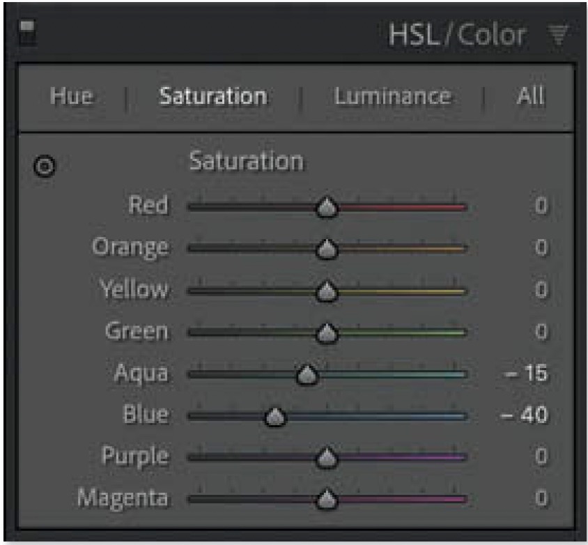
HSL/Color Panel
HSL/Color Panel: Open the HSL/Color panel in Lightroom’s Develop module. In the Saturation category, move the Blue slider to the left in order to cause just the blues to become less colorful. You may also need to move the Blue slider under the Luminance category to the right in order to compensate for the darkening caused by Vibrance.
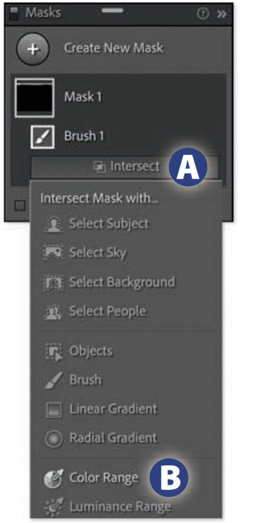
Masked Adjustment
When the special treatment of blue is beneficial in one area but undesirable in another, then consider masking the undesirable area and moving the Saturation slider to the left to make the area less colorful.
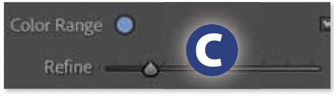
If you want the adjustment to affect only the blues within the masked area, hold Option (Mac) or Alt (PC), click the Intersect button below the active mask in the Masks panel A, and choose Color Range B. Click on an area within the masked part of the image that contains blue and fine-tune the Refine setting above the adjustment sliders C before adjusting the Saturation
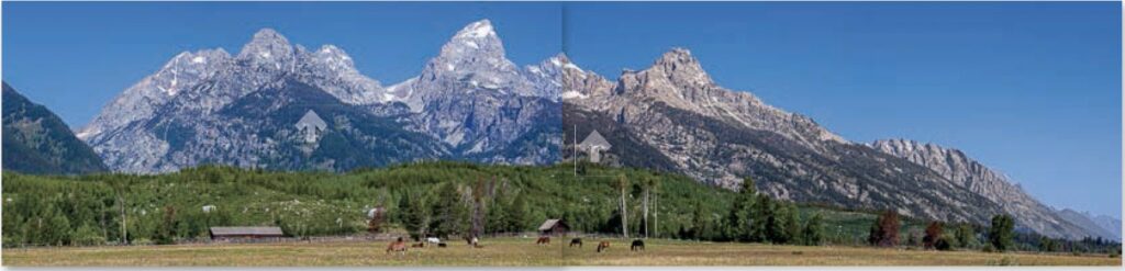
Right Half: Result of using a masked adjustment to lower saturation and shift the white balance of the mountains.
Excessive Saturation
This is an issue that only rears its head once you want to use an image outside of Lightroom’s Develop module. It can be as simple as opening an image in Photoshop, printing from within Lightroom, exporting to a standard fi le format such as JPEG or TIFF, or even viewing an image in Lightroom’s own Library module. In those cases, pushing the Saturation (or even Vibrance) slider too far can cause the colorful areas within an image to lack detail.
Lightroom’s Develop Module Color Space
The reason for potential detail loss comes down to a few technical concepts related to how color is reproduced in Lightroom and other programs. As I’ve mentioned many times before, behind the scenes, all your images are constructed from a mix of red, green, and blue light. You can see this first hand by visiting the Develop module, hovering over a color within your image, and looking just below the histogram, where the exact amount of red, green, and blue being used is displayed.
But those numbers are not quite enough to precisely describe a color. We also need to know the precise color of red, green, and blue that is being used. Just as you can measure distance in miles, meters, or microns, you can describe color using different versions of red, green, and blue. The particular set of red, green, and blue colors used to construct an image is known as the image’s color space, which is referred to by a name such as ProPhoto RGB, Adobe RGB, or sRGB.
Lightroom’s Develop module uses very vivid versions of red, green, and blue, collectively known as ProPhoto RGB. This not only allows it to reproduce all the colors that your camera is capable of capturing, but it also allows you some leeway for adjusting your images to make the colors even more vivid.
Converting to Different Color Spaces
When you send an image outside of Lightroom, it may end up being converted to a different color space, as ProPhoto RGB is not commonly used by the general public. Converting to a different color space means that the image will be constructed from less vivid versions of red, green, and blue. But that doesn’t necessarily mean that its appearance will change in the process.
You can think of it like converting between different sweeteners in a cooking recipe. Imagine professional chefs have access to a special sweetener that is not commonly available to the general public and is ten times as sweet as sugar. When they share a recipe with the public that calls for one cup of the special sweetener, they have to convert that to ten cups of sugar so the general public can use the recipe and get the same results.
Saturation Clipping
But unlike sweetener, which can be used in unlimited quantities, the RGB numbers that describe the colors within our images max out at 100% and can go no higher.
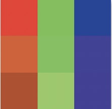
The color space used in Lightroom’s Develop module is made from versions of red, green, and blue that are much more vivid than the most popular color space, which is sRGB (see the relative difference between ProPhoto and sRGB at left). That difference can result in undesirable consequences when an image is exported to a JPEG file in the sRGB color space (the most common setup for files used on the internet).
Imagine a photo of a red rose where moving across the most vivid areas displays numbers for red between 92% and 99% below the histogram. Then consider that sRGB uses a red that is only 85% as saturated as the red found in ProPhoto RGB. That means you’d need to use 108–116% red in sRGB to reproduce that rose without changing its appearance (after all, 85% of 108 is 92, and 85% of 116 is 99). But the numbers can’t go that high and therefore the amount of red across the rose would end up being clipped to the maximum value of 100%. This would cause detail to be lost (red would be clipped, but there would potentially still be detail found in the green and blue that makes up the image). The rose would also become less colorful since 100% red in sRGB is less colorful than 92% red in ProPhoto RGB.
Hopefully this gives you the sense that changing from one color space to another can potentially cause issues for some technical reason that you really don’t want to think about.
But don’t get too worried about it, as this is usually only an issue for images that contain overly vivid colors. As you boost the saturation, the amount of red, green, or blue is increased to make one or more of those colors more prominent, and it’s only when you push them beyond what can be reproduced in a smaller color space that you might see the colors shift when you export. More detail about color spaces, sending an image to Photoshop, and exporting are found in chapter 2 of this book.
Previewing a Destination Color Space
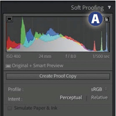
If you know an image will need to be saved in a color space other than ProPhoto, then you may want to use a feature called Soft Proofing in order to preview what the result will look like and fine tune the image to optimize it for the destination color space.
To preview the result of a conversion to another color space, head to the Develop module, choose View>Soft Proofing> Show Proof. Set the Profile pop-up menu to the desired color space, and set the Intent to Perceptual in the area below the histogram.
Enabling Soft Proofing will cause the histogram to reflect the result of a conversion to the destination color space. A histogram that extends all the way to the end of the area available and displays a tall color spike on the end is an indication of potential saturation clipping. You can then see where within the image such clipping occurred by choosing View>Soft Proofing>Destination Gamut Warning or clicking the icon that appears in the upper right of the histogram A.
The red overlay represents areas where colors were more colorful than what can be represented in the color space that is being previewed. I suggest typing Shift-S to toggle the visibility of the overlay, and typing S a few times to toggle the Soft Proofing feature off and back on again so you can evaluate how a conversion to the destination color space will affect the colors within the image. Just keep in mind that nobody else will be able to see this overlay and it does not mean that the color shift being made will even be noticeable. Those are just the areas you should evaluate with a critical eye as you toggle Soft Proofing on and off to see if they need to be further optimized in order to have them be satisfactorily rendered in the destination color space.
Optimizing for Destination Color Space
If you move any of the adjustment sliders while Soft Proofing is enabled, Lightroom will prompt you to choose between the following options.
Undo: Reverts the image to the state it was in when you first enabled Soft Proofing.
Make This a Proof: Allows you to continue adjusting the image; records the Profile and Intent settings in the Copy Name field, which can be seen in the Library module’s Metadata panel; and automatically reloads those settings any time you view the image while Soft Proofing is enabled.
Create Proof Copy: Creates a Virtual Copy in order to preserve the appearance of the image and produce a dedicated copy that can be optimized for the color space being previewed. As with the previous option, this will save the Soft Proofing settings and reload them any time the feature is enabled in the future.
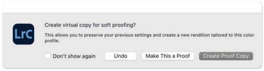
If you would rather not have to make this choice every time you attempt to adjust an image while Soft Proofing is enabled, turn on the Don’t show again checkbox, and then click either Make This a Proof or Create Proof Copy to define it as the default setting.
I often use the sliders found in the HSL/Color panel to fine-tune any colors that shifted in an undesirable way. The goal is not to get the red overlay to completely disappear, but to simply make sure the colors are acceptable while Soft Proofing is enabled.
Saturation Clipping in Photoshop
There are two general methods for determining where colors are being clipped due to excessive saturation when working in Photoshop.
Existing Color Space: Images that have been sent from Lightroom to Photoshop will end up in whatever color space is specifi ed in Lightroom’s External Editing preference. To see if any areas are clipped in the current color space, choose Layer>New Fill Layer>Solid Color, choose white for highlight clipping or black for the shadows, and then change the blending mode pop-up menu at the top of the Layers panel to Hard Mix. Clipped areas will appear as colors surrounded by solid black or white.
Preview Alternative Color Space: If you plan to convert to a different color space, then you can preview the results using a feature that is equivalent to Lightroom’s Soft Proofi ng by choosing View>Proof Setup>Custom. To toggle the preview on and off, choose View>Proof Colors, or type Command-Y (Mac) or Ctrl-Y (PC). Then choose View>Gamut Warning, or type Shift-Command-Y (Mac) or Shift-Ctrl-Y (PC) to see where the colors have shifted as a gray overlay (just like the red overlay available in Lightroom).
Unnatural Reflections
If you ever isolate the lower portion of an image and increase its brightness, pay attention to how such a change affects areas that contain water. Water will look unrealistic if it appears to be able to magically amplify the amount of light falling on its surface.
So, if you’re going to brighten the lower part of an image and it includes a reflection on water, consider either brightening the sky (if it’s what’s being reflected) to at least match the brightness of the reflection, or limit how much the reflection is brightened. This can also become an issue when a sky is darkened dramatically and reflections are not adjusted in a similar fashion.
This particular idea might be a pet peeve of mine since many people would never notice. But when I see an image with unnatural-looking reflections, my brain automatically switches gears and starts to analyze how the image was processed, as opposed to simply enjoying the image as a whole.
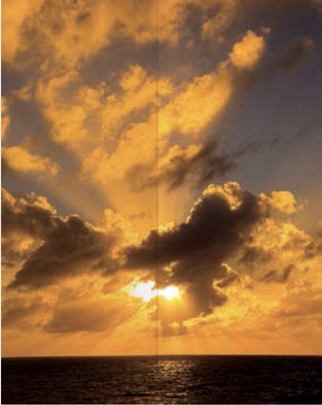
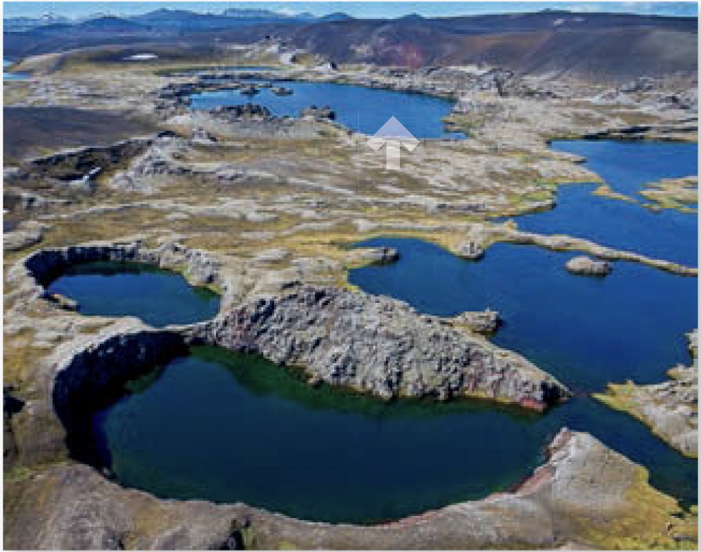
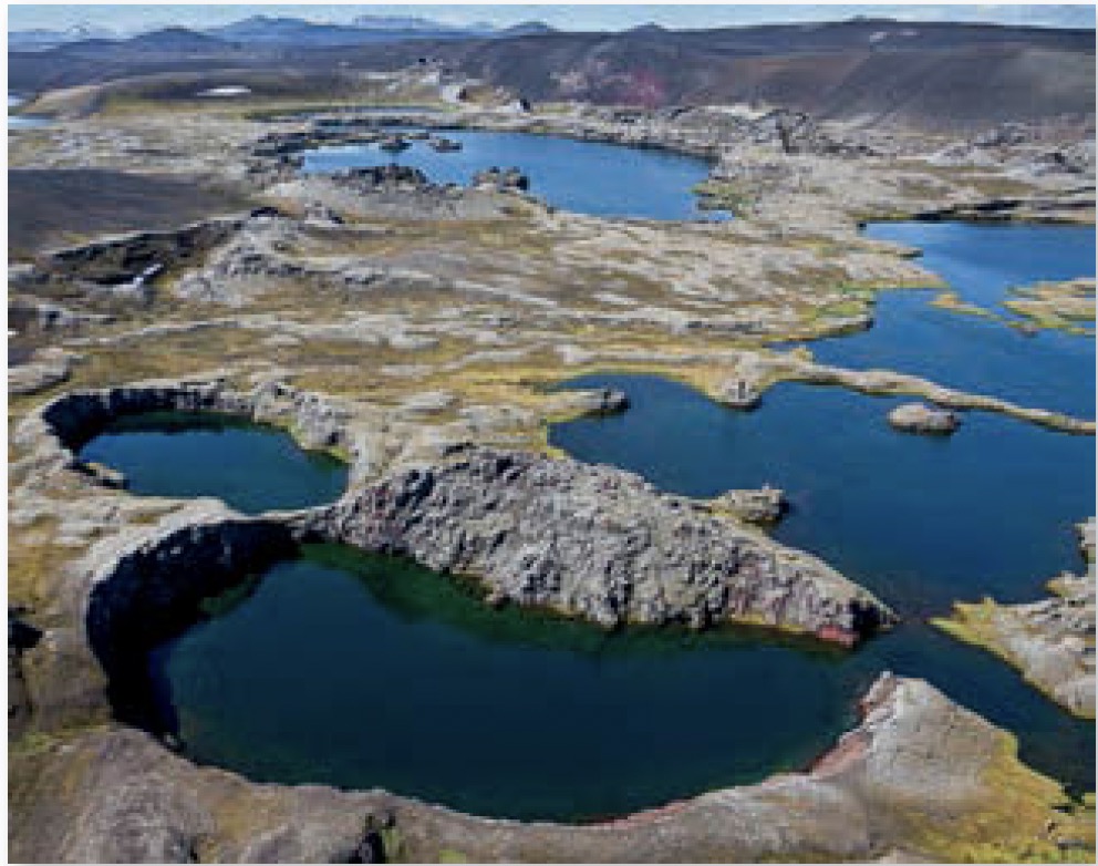
Unevenly Lit Skies
If you find yourself moving the Highlights, Shadows, Clarity, or Dehaze sliders up quite a bit, then be sure press the \ key multiple times to toggle between the before and after versions of the image (or press and hold the \ key for a temporary preview) to see if the sky ended up with any unnaturally dark areas. Those particular adjustments can tend to make the central portion of the sky unnaturally dark, especially on images that feature objects extending into the sky, such as trees or mountain peaks. There are two general methods for fixing such issues.
Adjust Sky with Opposite Adjustment Values
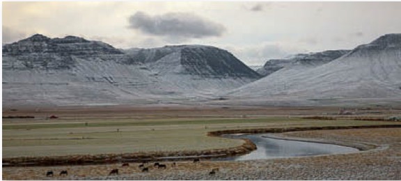
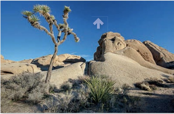
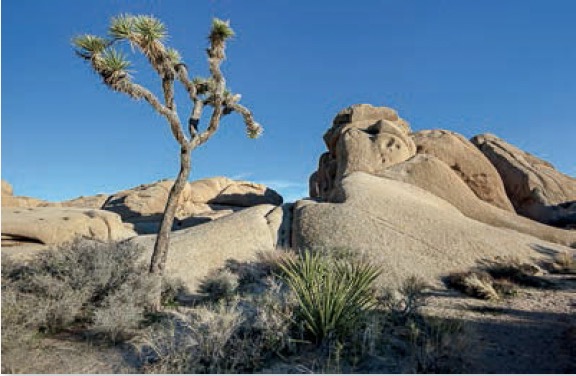
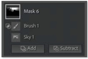
All of the adjustments mentioned above can be counteracted by applying opposite values via a sky mask. For instance, let’s say you applied Highlights -60 to the image as a whole in Lightroom’s Basic panel. You can then isolate the sky via a mask and apply Highlights +60 in order to cancel out that global change to effectively end up with a setting of Highlights 0 in the sky. Doing this with all of the potentially problematic sliders mentioned above should smooth out most unnatural-looking skies
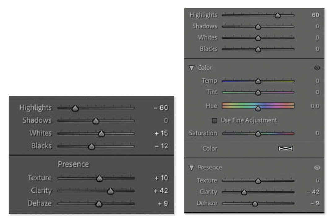
Settings applied in Basic panel of Lightroom’s Develop module. Highlights, Shadows, Clarity, and Dehaze have the potential to produce an uneven sky. The adjustments applied to the image as a whole via the Basic panel can be canceled out by applying opposite values of the same sliders in a masked adjustment.
Selective Brightening
You may find that you like the overall look produced by the sliders mentioned above and only find a limited area to look unnatural. When that’s the case, try creating a sky mask, then holding the Option key (Mac) or Alt key (PC) to reveal the Intersect button below the mask. Click the button and choose Brush from the resulting pop-up menu, set theFeather setting to 100, the Flow setting to around 30, and the Whites slider to 70.
With that setup, you should be able to effectively paint light into the areas that appear too dark. Painting over the same area multiple times while the Flow setting is below 100 will build up the effect and often produce a smoother result.
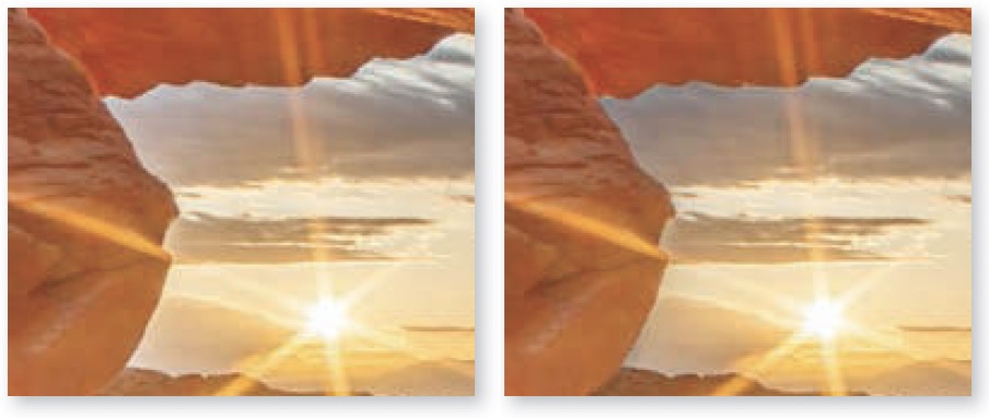
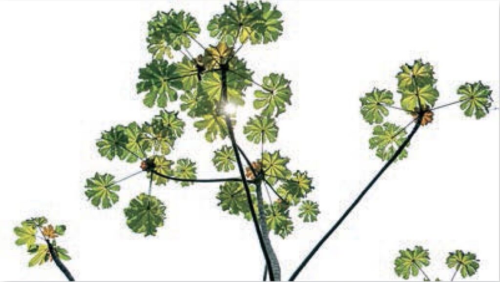
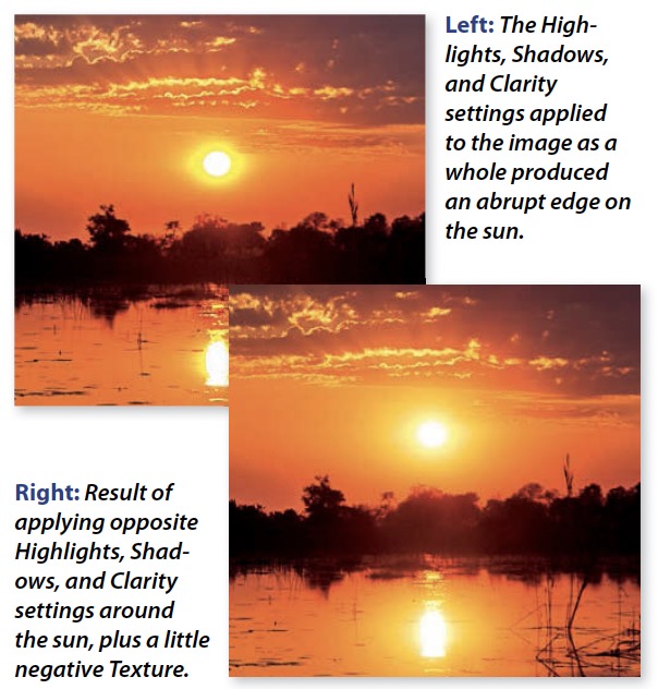
Odd-Looking Suns
The same sliders that can cause skies to become uneven (discussed on the last page) can also cause the sun to lose its natural smooth glow and be rendered with an unnatural halo around its edge.
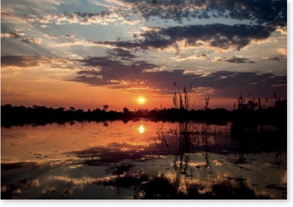
As with skies, applying a masked adjustment using opposite settings can make the sun look more natural. The only difference is that a soft-edge brush mask or radial gradient mask should be used in order to limit the adjustment to the sun and its immediate surroundings.
Adding a little negative Texture to the masked area is often the finishing touch needed to produce a smooth, radiant-looking sun.
Overly Colorful Shadows
It’s very common to boost both the Shadows and Vibrance sliders when optimizing an image. Doing this can cause the dark areas to appear unnaturally colorful since shady areas are rarely colorful in nature.
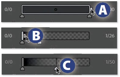
Lower Saturation in Dark Areas. When the darker areas in an image appear to be unnaturally colorful, isolate those areas by typing Shift-Q to create a Luminance Range mask. Then, to make the image less colorful, lower the Saturation setting of the mask to around -30. To limit the change to the darkest areas, drag the right end of the range tab A all the way to the left B. Then, to cause the adjustment to seamlessly blend into the surrounding image, move the upper fall-off slider C to the middle or beyond.

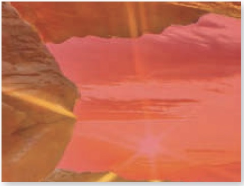
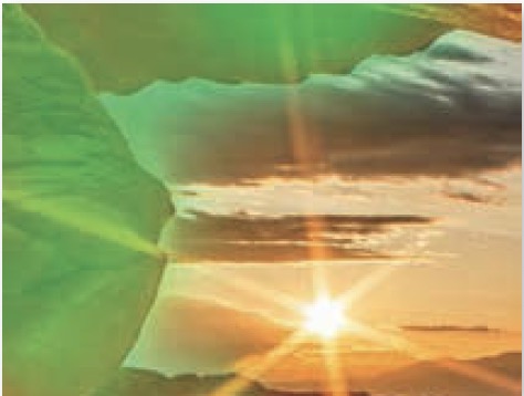
Object Halos
Few objects in nature glow, except for the sun, yet it’s not uncommon to encounter glowing objects in photographs that have been “optimized” digitally. The Highlights, Shadows, Clarity, and Dehaze adjustments can potentially produce bright or dark halos around the edges of areas where abrupt changes in brightness are found.
Substitute Masked Adjustment
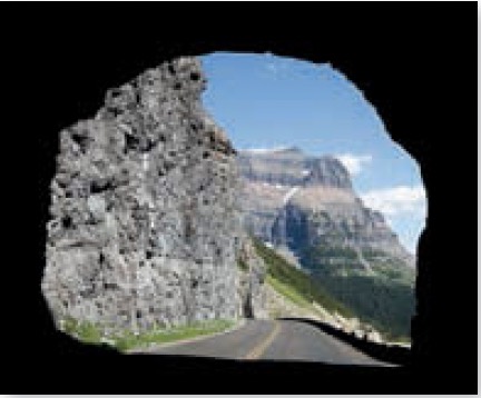
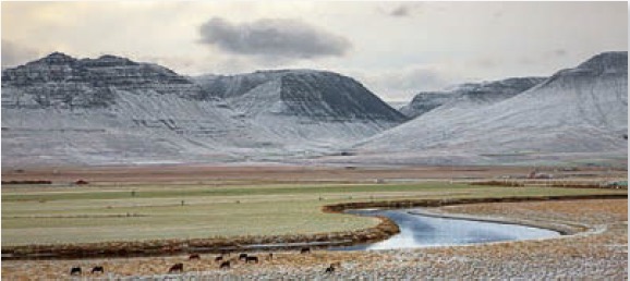
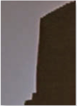
The most common area to find an unnatural halo is where a dark object touches the sky, causing the sky to become brighter around the edge of the object.
It’s usually easy to fix such issues by choosing Tools>Create New Mask>Select Sky in the Develop module, and then applying the opposite setting to the slider that is causing the halo. Then, substitute an alternative adjustment that does not commonly cause halos.
In this example, applying Highlights -100 caused a halo to appear around the perimeter of the sky. To fix the issue, a sky mask was used to apply Highlights +100 to remove the halo, and then Exposure -1.18 was substituted as an alternative method for darkening the sky.
When the above technique is inappropriate for the situation, you’ll have to head into Photoshop and apply a more sophisticated solution.
Selective Sharpening
Sharpening is performed by adding tiny halos around the edges of detailed areas. Wherever distinct differences in brightness are found, the bright side of the edge is brightened slightly and the dark side is darkened to increase contrast and make the transition more obvious. This increases the apparent sharpness of the image.
The tiny halos that result are usually small and subtle enough that they go unnoticed. But every so often, the bright halos get noticed. This is most common where a crisp-edged dark object touches a detail-lacking blue sky. It is more noticeable in images that are displayed on-screen, where every pixel is on display, than when an image is printed. That’s because inkjet printers utilize hundreds of tiny dots of solid cyan, magenta, yellow, and black ink to reproduce each pixel that makes up an image. This has the effect of concealing the tiny halos that sharpening produces.
When halos produced by sharpening are distractingly obvious, the following technique can be useful to selectively eliminate the bright halos while keeping the dark ones at full strength:
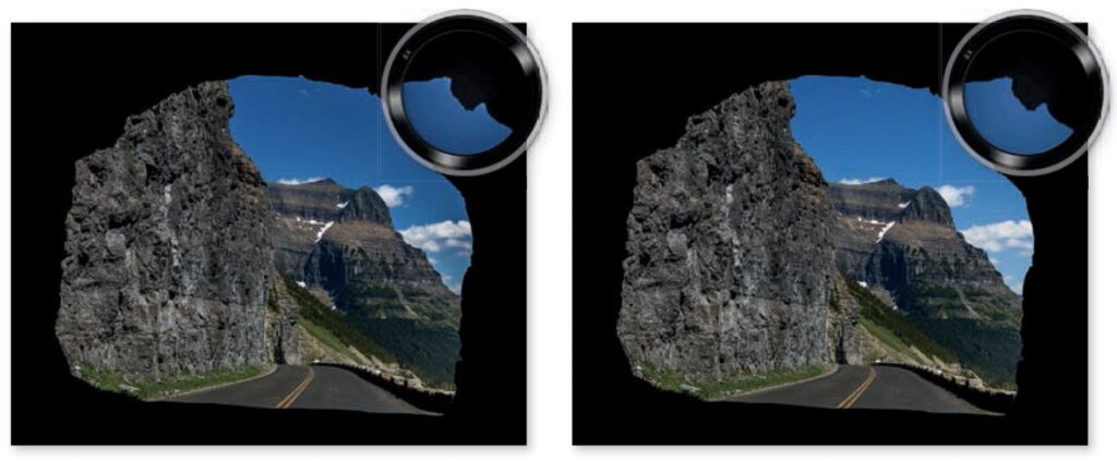
Right: Result of applying a sky mask with +100 Highlights to counteract the global one, and -1.18 Exposure to darken the sky.
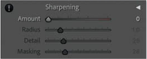
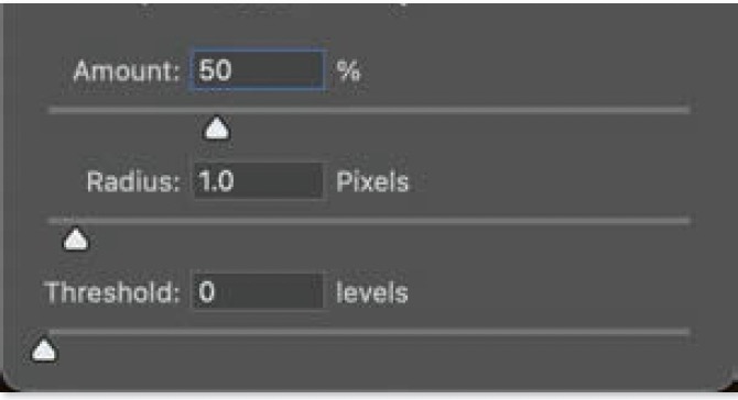
1) Turn off Lightroom’s default sharpening by visiting the Detail panel of the Develop module and changing the Amount setting under the Sharpening heading to 0.
2) Open the image in Photoshop by choosing Photo>Edit In>Edit In Photoshop. It is important to use this method instead of File>Export, since additional sharpening would usually be applied when exporting.
3) Create a copy of the original image layer, so you can sharpen it separately from the original, by choosing Layer>New>Layer Via Copy, or type its keyboard shortcut Command-J (Mac) or Ctrl-J (PC).
4) Now it’s time to sharpen that duplicate layer by choosing Filter>Sharpen>Unsharp Mask (or Smart Sharpen, which is a more feature-rich alternative). Fine-tune the settings to your liking while ignoring any distracting bright halos.
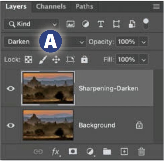
5) To limit the sharpened layer so that it can only darken the image, change the blending mode pop-up menu at the top of the Layers panel to Darken A. Then double-click on the name of the layer and change it to something like “Sharpening-Darken” so its purpose is obvious.
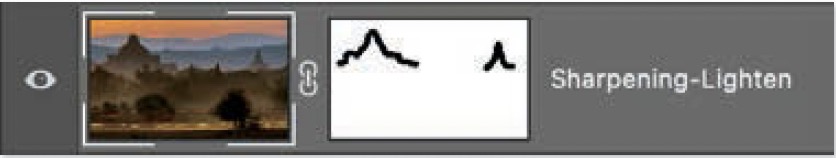
6) Now let’s bring back the missing bright halos by choosing Layer>New>Layer Via Copy once again, and then changing the blending mode pop-up menu at the top of the Layers panel to Lighten. Then, double-click on the name of the layer and name it something like “Sharpening-Lighten.”
7) Now it’s time to eliminate any of the bright halos that are distracting. With the layer that is set to Lighten still active, choose Layer>Layer Mask>Reveal All. Activate the Brush tool, type D to set your foreground color to black, and then paint over the image wherever you find the bright halos to be distractingly noticeable.
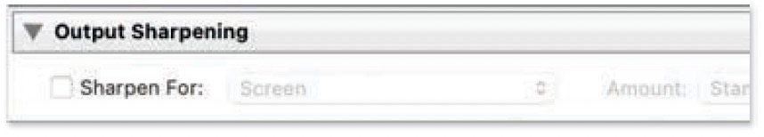
8) Export without additional sharpening: Once you’ve finished, save and close the image and return to Lightroom. Then, when you need to produce a file in a common file format, choose File>Export and choose the preset that is closest to your desired results from the list on the left. Then fine-tune any appropriate settings on the right and be sure to turn off the Sharpen For checkbox that’s found in the Output Sharpening section.
Clone in Darken Mode
When an undesirable halo is only a few pixels wide, a combination of retouching and blending modes will usually be enough to eliminate the halo using the following technique:
1) In Lightroom, choose Photo>Edit In>Edit In Photoshop.
2) In Photoshop, select the Clone Stamp tool. Then, in the Options Bar that spans the top of the screen, turn on the Aligned checkbox and set the Sample pop-up menu to Current & Below.

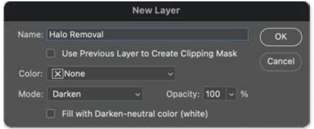
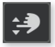
3) Next, create a new empty layer by choosing Layer>New>Layer, or by holding Option (Mac) or Alt (PC) while clicking on the New Layer icon at the bottom of the Layers panel. In the New Layer dialog, name the layer something like “Halo Removal,” set the Mode pop-up menu to Darken and then click OK.

4) Hold Option (Mac) or Alt (PC) and click just outside one of the undesirable bright halos to set the area as the source for the Clone Stamp tool. Be sure the area would be a good replacement for the halo.
5) Using a small, soft-edged brush, paint over the nearby bright halo to replace it with the area you defined in the previous step. Since the layer is in Darken mode, your retouching will not be able to brighten the image. Therefore, overspray onto darker areas will not affect the image.
Masked Curves Adjustment
When a halo is so large that it could be described as a glow, then you may need to use an adjustment layer to change the brightness of the affected area, and then use a mask to limit where the adjustment can affect the image. Let’s tackle this in two parts. First, we’ll perform the appropriate adjustment. Second, we’ll limit the adjustment to affect only the area that contains the glow. To correct for a glow, do the following:
1) Starting in Photoshop, choose Layer>New Adjustment Layer>Curves.
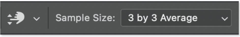
2) Activate the Targeted Adjustment tool (hand icon) in Curves. Then make sure the Sample Size pop-up menu found in the Options Bar that spans the top of the screen is using a setting no higher than 3 by 3 Average.
3) Click on either the brightest part of the bright glow or darkest part of a dark glow, while ensuring that you are at least one pixel away from the edge of the object that appears to be glowing. This will add a point to the curve, and the Input number below the curve will indicate the exact amount of light contained in the area where you clicked.
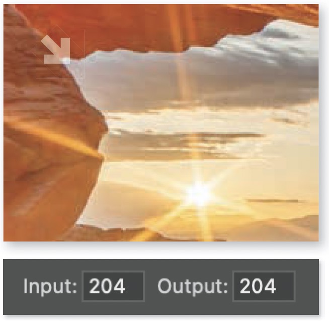
4) Now, find a reference spot in the image that is immediately outside the glow and represents the brightness you want to end up with when replacing the glow. Once you’ve found an appropriate spot, hover over it (but don’t click) and note the number that appears in the Input field below the curve. That tells you the exact amount of light that’s currently in the reference spot.
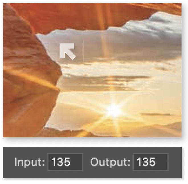
5) Finally, click within the Output field below the curve and enter the number you noted in the previous step. This will cause the area you clicked on within the glow to match the brightness of the reference spot.
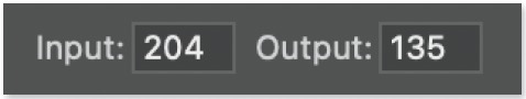
At this point, the glow will have been adjusted so that it matches the brightness that was originally found immediately outside its bounds. Now the adjustment needs to be masked in order to limit its effect to a specific area in the image. This can be accomplished by doing the following:
1) Start by isolating the area that contains the glow from the rest of the image. You can do this by making a selection using the techniques covered in chapter 2.
2) With the Curves adjustment layer active, hold Shift and click on the Group icon A at the bottom of the Layers panel. Then click on the Layer Mask icon B in order to transform the selection into a mask. That group C will prevent the Curves adjustment from affecting areas that are outside the selection that was created in the previous step.
3) Click on the layer mask that is attached to the Curves adjustment layer D to make it active. Then choose Image>Adjustments> Invert to fill the mask with black. This will prevent the adjustment from affecting the image.
4) Activate the Brush tool and choose a large, soft-edged brush. Type D to ensure the foreground color is white, and type 3 to change the Opacity of the Brush tool to 30%.
5) Finally, paint over the object that appears to be glowing and extend into the glow using multiple paint strokes and varying brush sizes to gradually build up the adjustment until the glow has been effectively eliminated.
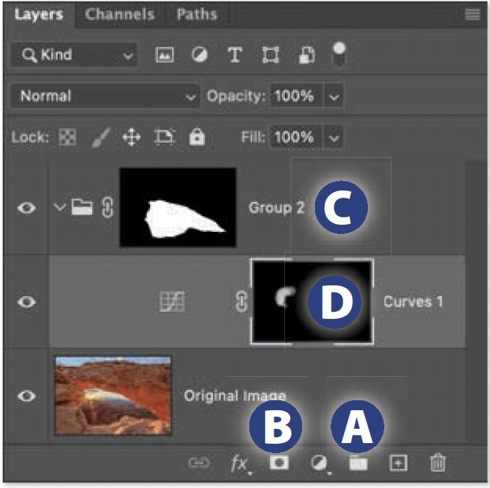
6) If the brightest part of the adjusted area remains too bright, then drag the upper-right point on the curve downward E.