The following is an excerpt from Adobe InDesign A Complete Course & Compendium of Features by Steve Laskevitch. To follow along with this lesson, download the files here.
In the following lessons, we will learn the basics of creating a new document and populating it with styled text and carefully sized and positioned images. The result will be a fun and colorful poster.
Lesson A: Create a New Document
Like with any endeavor, your work in Adobe InDesign will benefit from some preparation and setup. However, for this first “get to know you” project, we’ll keep that to a minimum. Let’s start creating a poster!
First, launch InDesign. Use the Creative Cloud app, as that’s your “hub” for all Adobe apps. Once the program is running, you can create a new document either by going to File > New > Document… or by clicking on the Create New… button on the welcome screen. If you use the menu method, you’ll notice a keyboard shortcut that does the job, too: on a Mac, it’s ⌘-N (hold down the command key and type “n”), and on Windows, it’s Ctrl-N (hold down the Ctrl key and type “n”). Hereafter, I’ll indicate shortcuts in that order for Mac and Windows, respectively, like this: ⌘-N/Ctrl-N.
Now you’re facing a large window with many presets and fields to fill out. Don’t be daunted by the choices—or the units of measurement. Choose the Print intent at the top of the New Document dialog box. Ignore the strange dimensions (66p0 x 102p0) for the moment and choose Tabloid as your page size.
On the right side of the dialog, you’ll see a menu for Units: we will use inches for this project. Disable Facing Pages and expand the choices for Margins and Bleed and Slug. You’ll need to click on the chain to the right of the margin dimensions so you can set them independently.
Now you can have a five-eighths inch space at both the top and bottom, and one-quarter inch on each side. Set those and the other fields as seen here.
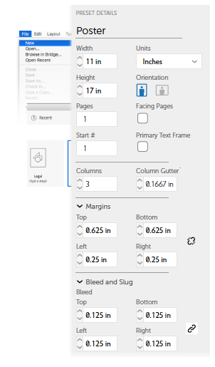
Note: For fractions (like the 5/8″ top/bottom margins or 1/8″ bleed), just type the fraction! InDesign will convert it to a decimal. Click Create when you’re sure the settings are correct.
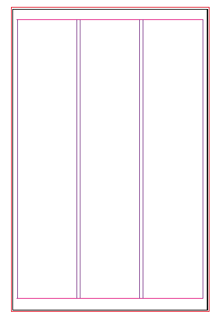
Your document should look something like the figure below.
Choose File > Save As… to save your file. I’d suggest navigating to the folder you downloaded with all the files that accompany this book (see “Introduction”), and saving this file in the “Project 1” folder.
What are margins and bleed? Good Question. Read the “Anatomy of a Spread” section in the Compendium chapter, “Pages & Spreads” (page 279).
We will be placing two images onto this page and pasting some promotional text into a text frame. But right now, an empty canvas awaits us. Let’s dress it up!
Lesson B: Placing the Images
In InDesign, everything—every letter, every image—has to be in a frame. For images, sometimes it’s easy to have InDesign make a frame for you as you place an image. Often, we create frames first, and then insert images into them. That’s the way we’ll do it in this first exercise.
Place a Large, Full-Bleed Image
Locate the Rectangle Frame tool about halfway down the Tools panel (see figure below). Use it to draw a box from the upper-left corner of your bleed to the lower-right corner of the bleed. The image we are about to place will be slightly larger than the page (the black outline). If you find that the box you have drawn is not exactly in the right position or is not the right size, switch to the Selection tool, which is found at the top of the Tools panel. With it you can drag a corner of the box or the box itself to fine-tune its dimensions or position.
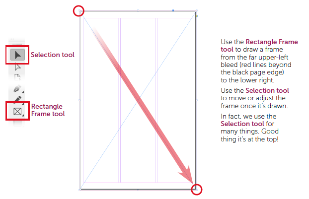
The frame is drawn; make sure that it is selected. Use the Selection tool to click in the middle of the box, and you will see that its control handles are visible. It’s time to get the image!
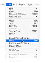
From the File menu, choose the command Place. Notice that to the right of the command there is a keyboard shortcut you could use instead. Over time, we will place many images, and it is likely you’ll memorize that shortcut.
For now, using the menu is perfectly fine.
Do you remember where you put the downloaded course files? InDesign is asking you to locate the image you want to place. Navigate to your downloaded course files, and locate the “Project 1” folder. In it, you will find an image called sky.jpg. Double-click the filename, and the image will fill the frame you drew a few moments ago. Fortunately, the image was created at precisely the correct size to fill that frame. We will not be quite so lucky with the second image. Choose File > Save or use ⌘-S/Ctrl-S to save your file.
Layers: Stacking and Protecting Content
The image you just placed will serve as a backdrop to the other content we are adding next. InDesign offers several ways to prevent a user from accidentally moving or deleting content. The method I use most frequently is Layers.
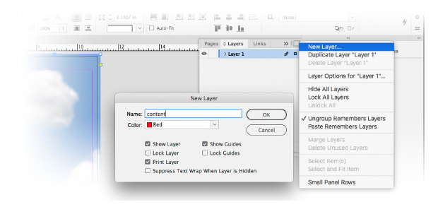
On the right side of your screen, locate the Layers panel. If it’s missing, use the Window menu and choose Layers. Every panel in InDesign has a small menu in its upper-right corner. Unsurprisingly, these are called panel menus! The first item in a panel menu is the creation of a new… whatever that panel controls. So if you click on the Layers panel menu, the first item is New Layer…. This poster’s text and a second image will be on a new layer that we’ll name “content.”
Use the Layers panel menu and choose New Layer…. In the dialog box that appears, enter the name “content.” When you select a frame on that layer, the frame edge will have the color you choose below the name. I will choose red. To commit your choice, press the Enter key or click on the OK button (they do same thing).
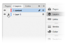
To prevent us from accidentally editing the sky image, we should lock the layer that it’s on. In the Layers panel, you should see two eyes: one for each layer. Clicking on an eye hides a layer, and clicking there again reveals it. The space to the right of an eye holds a padlock that prevents the editing of that layer.
To protect Layer 1, click to the right of its eye. To edit our new content layer, click near its name to highlight it. Now we’re ready to add more stuff.
Create an Empty, Elliptical Frame
See all those tools on the left side of the InDesign workspace? Almost every one of them is actually the first of several in a group. If you right-click on the Rectangle Frame tool, two other tools are revealed. Mac users: either use a two-button mouse or use your mouse system preferences to add a “secondary click” function to your Apple Magic Mouse—it’s worth it.
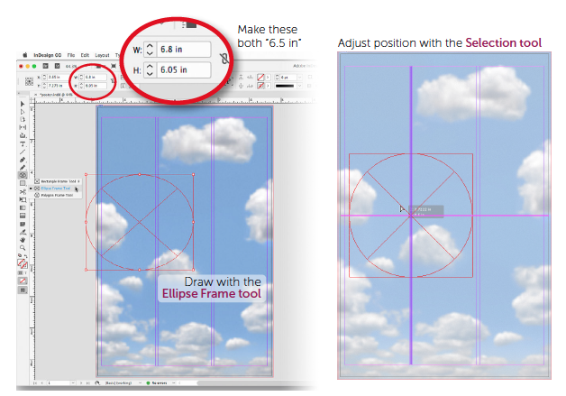
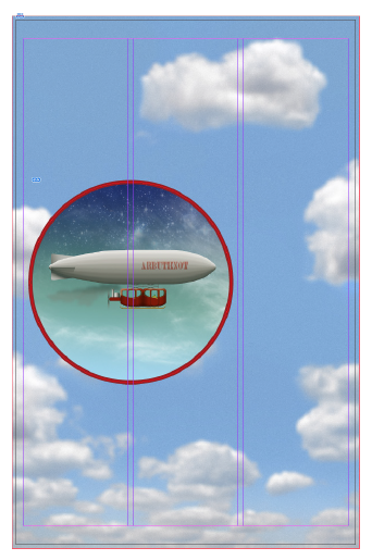
Choose the Ellipse Frame tool and drag out a loosely shaped ellipse somewhere on the left side of the page. We’ll refine its size and position in a moment. If you make a mistake, you can undo it by choosing Edit > Undo (like in any software application) or using the universal shortcut ⌘-Z/Ctrl-Z. To fine-tune the size, we’ll make this ellipse a perfect 6.5 x 6.5-inch circle by entering those dimensions in the width and height fields in the Control panel.
Switch to the Selection tool to fine-tune the position of the circle.
As you drag the circle, you’ll see purple or pink lines appear now and then. These are called Smart Guides and they tell you when your object is aligned to some part of the page, margins, columns, or even some other objects! When a Smart Guide appears, its end points tell you what your object is aligned to. Move your circle slowly up and down, and you’ll see a pink line appear from the left edge of the page to the right when you’re centered vertically. A purple line appears when you’re aligned between the first and second column guides. This is where I’ll leave this frame, but its exact position is up to you. We’ll see how this frame looks with an image in it and when there’s text on the page.
Save! Choose File > Save or use ⌘-S/Ctrl-S.
Place an Image into That Circle
Part of this should sound familiar.
With the circle selected (via the Selection tool), choose File > Place… and navigate to your Project 1 class folder (you might already be looking at it: InDesign usually brings you to the last folder from which you placed an image). Choose the image called airship.jpg.
You should find that the image fills the ellipse and that you can see only a small bit of it. No worries!
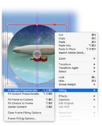
Right-click within the circle (I’d recommendoff-center). A rather long menu appears, filled with items that could be useful when editing an image frame. Choose Fitting > Fill Frame Proportionally. This sets the image to fill the circle, but crops as little of it as possible. Frames can be decorated, even if they have images or text in them. In this case, we’ll add a border, or, as we call them in InDesign, a stroke.
Add a Colorful Stroke to the Frame
With the circle still selected (select it with the Selection tool if you need to), expand the Color panel on the right side of the screen. In that panel’s upper-left corner are two small boxes, one overlapping the other. The one that is slightly higher and to the left of the other is for filling a frame with color. The other one with a gap in the center is for designating a stroke color.
Click on the stroke box to bring it to the fore, and move your cursor over the small rainbow at the bottom of the Color panel. Your cursor will turn into a small eyedropper with which you can choose a color. A red, like the undercarriage of the airship in the picture, should make a nice accent.
The color you choose from the rainbow is, at best, approximate, so it’s likely not exactly what you want.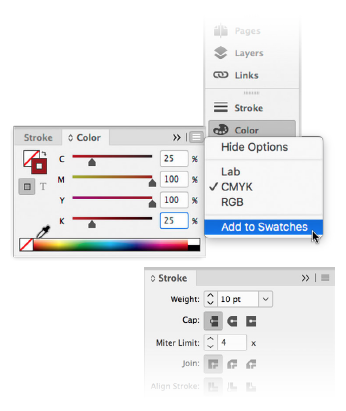
Fine-tune your color choice with the sliders above the rainbow. Here, the sliders are showing colors as CMYK (Cyan, Magenta, Yellow, blacK) and I will leave them that way for now. As you can see in this figure, I thought the following values worked well: 25, 100, 100, and 25, respectively.
In a few moments, we will be adding text—perhaps the title can also be in this same color, so let’s save it. Note that the Color panel, like the Layers panel earlier, has a panel menu in its upper-right corner.From this menu, we can choose different ways of designating color (Lab, RGB), and we can add this particular color to our swatches panel so we can easily select it later.
Just above the Color panel is the Stroke panel. From its many options we need only to choose the weight of the stroke (the current weight, or thickness, of the stroke is only one point—almost too small to see).
Set Weight to 10 points.
Save! File > Save or use ⌘-S/Ctrl-S.
So far, our poster is looking pretty good, but it is missing one rather conspicuous element: words! Just a little word of warning before we move on: when using your Selection tool, beware of the those concentric circles in the center of an image over which your cursor hovers.
That’s called the Content Grabber (also known as the “Donut,” a nickname preferred by many). If you unintentionally (or, of course, intentionally) drag it, you will dislodge the image from its frame! That is its intent: to allow you to recompose images within their frames. Later, we’ll see how we can crop an image by resizing its frame, and then recompose it using the Donut. But now, a word about words….
Lesson C: Adding Text
Procure a Few Fonts
We should have fonts that go with our Victorian/Steampunk-themed poster, so I’ve come up with a way for you to get a few nifty fonts quickly, provided the computer you’re using can currently access the Internet and the Creative Cloud app is running (see the Introduction).
In the Project 1 folder is a file called TheFonts.indd. Open it by double-clicking on the filename, or from within InDesign by choosing File > Open…. You will almost instantly get a message that there are missing fonts. Don’t be alarmed, but don’t dismiss this warning: we need that dialog box. Having just reread that dialog box, I’m impressed with its clarity and plain language—so much better than messages like “unknown error occurred.” My synopsis: the three lines of text each use a different font. Those fonts are not installed on your computer, but they are all available from Adobe Fonts (formerly called Typekit). In InDesign, pink highlighting identifies text that wants to use “missing” fonts.
In this document, click the Activate button and the missing fonts will be installed. It may take a bit, so take those moments to marvel at the work you’ve done so far. Well done!
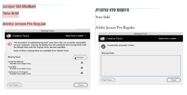
When the fonts have completed syncing, you’ll be notified in that same dialog box, which you may now close.
Also, close the document TheFonts.indd; it’s done its duty. We now have fonts we can use in any document. The order in which they’re listed above happens to be the order in which we’ll use them, too. Juniper will be our title font; Yana, our subhead; and Jenson will be for our body copy, which occupies most of the reader’s time (like these words).
Add a Text Frame and Text
I have another file for you to open, but not in InDesign. Again, it’s in your Project 1 folder. It’s called PromoCopy.txt.
Double-click this file, and it will likely open in TextEdit (on a Mac) or Notepad (on Windows).It is simply a plain text file with the promotional copy we want to use for our poster. When you open this file, highlight all the text and then copy it. You can use the shortcut ⌘-C/Ctrl-C to copy, as you can in InDesign or any text-editing application.
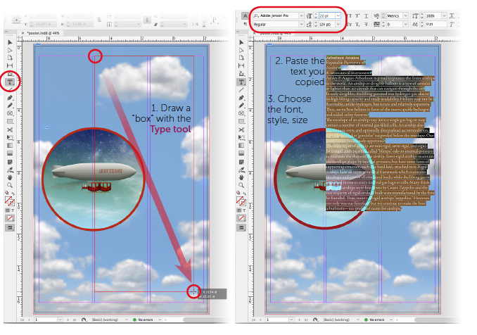
Back in InDesign, choose the Type tool (the big “T” in the Tools panel) and draw a box covering the second and third columns, using the guides to, eh, guide you. Remember, you can adjust the size and shape of this box later. Once the box is drawn, you’ll see the text cursor blinking in its upper-left corner.
Paste the text we copied from that text document by pressing ⌘-V/Ctrl-V, or by going to Edit > Paste. Other shortcuts that you might know from other programs like Microsoft Word can be used in InDesign as well.
Let’s use one of those shortcuts now. Press ⌘-A/Ctrl-A to select all the text so we can format it. To start, let’s set one of those fonts we procured: Adobe Jenson Pro Regular. Make sure all the text is highlighted, then choose that font and style from the Control panel or the Properties panel, as well as a legible body copy size for a poster—say, 20 points.
Save! File > Save or ⌘-S/Ctrl-S.
You probably noticed that the text is currently obscuring an image. That detail is one we’ll take care of at the end.
The Title and Subhead
Just above, I wrote that there are features (like shortcuts) that function in InDesign the same way they do in other applications. If the Type tool is still active, click once somewhere in the text frame. As you might expect, the cursor is blinking at that location. Now double-click on a word and you’ll see that it’s highlighted, just as it would be in any other program. InDesign can go further: triple-click, and yes, a whole line gets selected. Quadruple-clicking selects an entire paragraph and quintuple-clicking (a rare phrase!) selects the entire story. I prefer these noisier methods rather than clicking-and-dragging the cursor because I sometimes miss characters when I use the latter, slower method. Before we select and carefully size and style the top lines of text, let’s be sure the frame is the right size.
From the Tools panel, choose the Selection tool again. Adjust the size of the text frame by dragging its handles until they snap onto the guides. Sometimes, I have to drag too far, release, and then drag the handles back so the frame snaps nicely to the guides. Doubleclicking in the text frame switches quickly to the Type tool. With all the clicking you’re doing, anyone nearby will think you’re very busy!
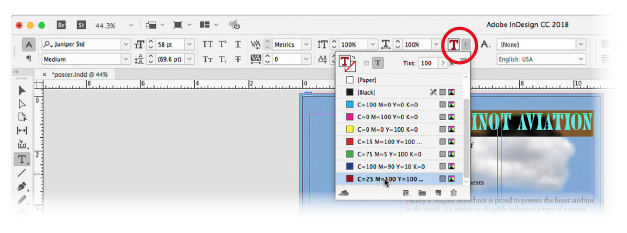
Now let’s select the top line, “Arbuthnot Aviation.” Since it’s also a paragraph, you can either triple- or quadruple-click to select it. Change the font to Juniper, then adjust the type size in the Control panel or the Properties panel using the menu or the small up/down arrows next to the size field. I found 58 points worked nicely.
Let’s make this title the same color as the circle’s stroke. With that text still selected, choose its color from the Fill menu in the Control panel (see the following figure).
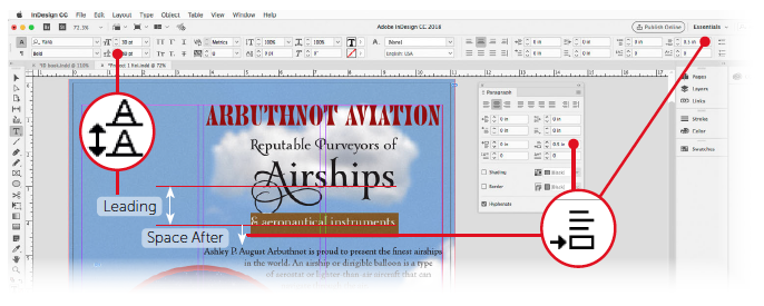
Select the subhead lines, “Reputable Purveyors of Airships & aeronautical instruments.” I think the font Yana would be just right here, but the size of each line (each is a paragraph) and the space between them will need adjustment.
Look at the figure above.
To push the letters of one line down away from the line above it, we select that whole line and adjust its Leading (named for the metal—lead—once used to separate lines of metal type).
To push the text below a selected paragraph downward, we use Space After. Both of these functions can be found in the Control panel, if there’s room. If you’re using a small screen and can’t find the Space After field on the right side, summon the Paragraph panel: Window > Type & Tables > Paragraph.
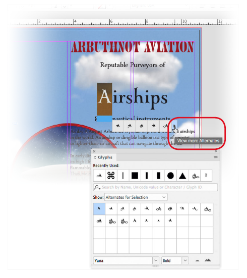
Before making final decisions about each line’s size, leading, and spacing, let’s add some flourishes that the Yana font allows. Highlight the “A” in “Airships.” InDesign notes that the font designer provided alternate glyphs (characters) for the highlighted one and shows you a few. If there are more than a few, an arrow at the end of the list invites you to “View more Alternates.” Let’s!
Clicking that arrow summons the Glyphs panel, which shows all of the alternates for the letter you’ve selected. To choose one, double-click it. Each time you do this, a different alternate takes the place of the previous. I chose one with extra swirls. I also chose alternates for the “R” in “Reputable” and the “P” in “Purveyors.” Now that we have our text with the appropriate glyphs, we can better situate it.
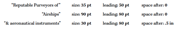
Select each line in the subhead (triple-click!), and experiment with its size and leading. My choices were as follows:
One last typographic touch: select all the text (quintuple-click!) and uncheck Hyphenate in the Paragraph panel (or the Control panel if the checkbox is there). Much better! Now get the Selection tool.
Add Text Wrap
This is our last tweak to the poster. The picture of the airship is currently partially obscured by the text.
Using the Selection tool, click on the left half of the circle (the right half is under the textframe, making it more difficult to get at). We can now add a kind of force field called Text Wrap that will push text away from our shape. Go to Window > Text Wrap, and its panel appears.
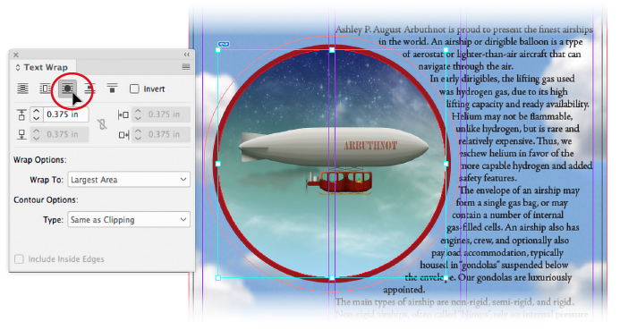
The first button is the Text Wrap off switch.
To conform to our circle, we need the third button, “Wrap around object shape.” Use the small arrows below that to increase the offset. Warning: Don’t try to move that circle until you either hit the esc key on your keyboard or click on nothing with the Selection tool first. Because of a quirk with this type of Text Wrap, you could dislodge the image from its frame!
Save! File > Save or ⌘-S/Ctrl-S. And, unless you’d like to show someone first, you may close the document via File > Close or ⌘-W/Ctrl-W.
That’s It!
Congratulations! You’ve made your first InDesign publication. There are many features and functions we skirted, and some further customizations to InDesign that will help us work more easily. The next chapters will contain exercises to familiarize you with important ingredients that we use when cooking with InDesign. So, when we get to our next project, you will know better what you may wish to include.