The following lesson is an excerpt from Adobe Photoshop A Complete Course & Compendium by Steve Laskevitch. You can download the files you’ll need to follow along with this lessons here.
A quick project to illustrate several of the major functions of Photoshop: retouching, color adjustments, painting, filters, and compositing with masks.
Lesson A: Opening Multiple Images
Do you remember where you put the files you downloaded? In the main folder there is a folder called “Project A- Welcome” with the files we need for this project.
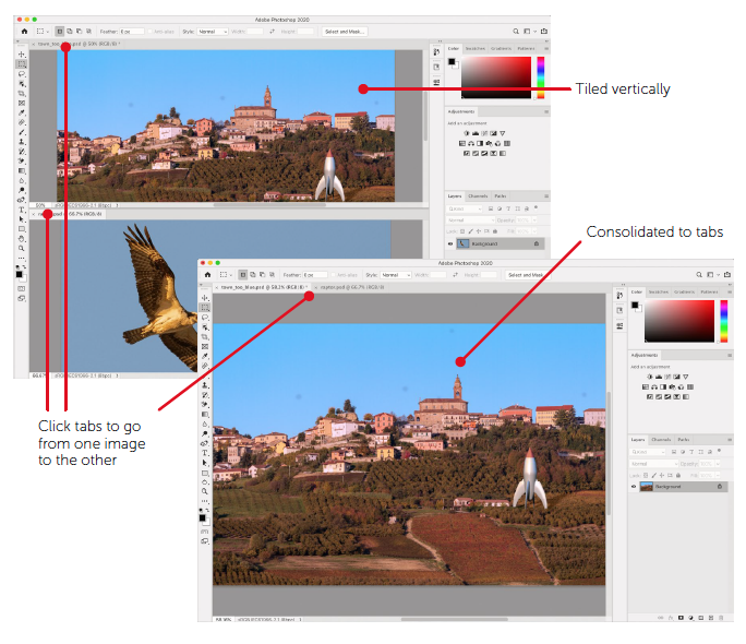
- Open two of the files in that folder: “town_too_blue.psd” and “raptor.psd.” You may not realize both are open in Photoshop until you look closely toward the upper left of the interface. There’s a tab for each document. Click each tab to go from one to the other. You can see them side-by-side or one below the other if you wish:
- Choose Window > Arrange > Tile All Horizontally or Tile All Vertically. That can be useful at times, but we’ll find the space-saving aspect of tabs advantageous most of the time. So to get back to that:
- Choose Window > Arrange > Consolidate All to Tabs.
Lesson B: Intro to Layers
We interrupt this exciting project (so soon?) to bring you a short explanatory exercise.
- From the “Project A- Welcome” folder, open the image called “trading faces.psd.”
Backgrounds vs Pixel Layers
The most important feature in Photoshop is the Layers panel and what it contains. The longest (and first) chapter in this book’s Compendium is called “Layers & Smart Objects.” I can promise it will likely be the one you refer to most. This document contains two layers, one of which is hidden. Look at the Layers panel in the lower-right corner of Photoshop’s interface.
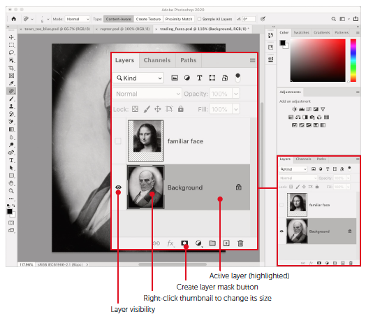
The document has two layers of two different kinds: a Background and a pixel (or image) layer. Backgrounds are very limited: they have to be the bottom layer and they cannot have transparency. Sometimes we need to change layer stacking order or achieve transparency, so we end up converting the Background into a pixel layer or something called a Smart Object.
Let’s explore a few of these things.
- Right-click on either layer thumbnail and choose Large Thumbnails. When layers proliferate, you’ll want them small again, but this should be helpful for now.
- Click the small square to the left of the layer called “familiar face.” It’s now visible.
- Click once near the top layer’s name. The layer is now highlighted, which means it’s the active layer.
When a layer is active, anything you do happens to that layer alone. We could move, blur, or lighten or darken it, and all other layers will remain untouched. We are going to mask this layer, hiding the bits we don’t want to see. When we’re done, her face will be on his head! But that’s a little later.
- Click the little padlock near the Background’s name. As you can see, it isn’t a hard lock to pick!
Now that layer is no longer a Background. It needs a better name.
- Double-click the current name and type something. I think “grumpy face” is appropriate.
- Drag that layer just above the other one. You’ll see a blue line appear when you get to the right spot. Then drag it below again.
Layers higher in the stack are in front of and obscure those below.
- Highlight the top layer (“familiar face”). Note the Opacity control near the top of the Layers panel.
There are several ways to make the layer less opaque. Try this: hover the cursor over the word Opacity and notice how it looks like a pointing hand with tiny arrows pointing right and left. That’s a “scrubby cursor.” It is available whenever you hover over the name of a numeric field. To “scrub” the value of that field, press and drag left or right to lower or raise (respectively) the value.
- Scrub the Opacity to the left to lower it. Note that I’ve already positioned that layer over the face of Mr. Grumpy. We’ll learn about how to do that soon. Scrub the Opacity back to 100%.
We can now return to our actual project, but let’s leave this document open for now. If you’d like to save it, press ⌘-S/Ctrl-S or choose File > Save.
Lesson C: Basic Retouching
The photo of the Italian hill town (“town_too_blue.psd”) has several problems. First, I realize that it’s kind of boring. Yes, it looks like a nice town, but there’s nothing notable or unusual about it. That’s why we’re going to put a bird on it. Also, although it was photographed near sunset, the golden light seems to be missing. It’s too blue. We’ll fix that in Lesson D, shortly.
First, let’s deal with those ugly blemishes in the sky. These appear to be bits of dust on my camera’s sensor and so are likely in the photos I made shortly after this one too. To deal with these, we’re going to use a powerful (but simple-to-use) tool and a professional workflow. See the “Retouching & Repair” chapter in the Compendium for much more.
Nondestructive Retouching
Retouching is almost always obscuring flaws or blemishes with more acceptable material. That is, we take good bits from one part of an image (or another one) and put those over the bad bits. Because I make mistakes or change my mind, I use layers when I do this. I put the good bits on their own layer. If I later realize I made an error, I simply erase that bit.
- In the image “town_too_blue.psd,” create a new layer. Either use the Layers panel menu (the small lines in that panel’s upper-right corner) to choose New Layer… or go to Layer > New > Layer…. This will open a dialog box that prompts for a name. Let’s use “Retouch.”
That is now the active (highlighted) layer in the Layers panel. Of the many tools Photoshop has for retouching, let’s just go with the one that’s used most often.
- In the Tools panel, select the Spot Healing Brush tool (it resembles a bandage with a dotted oval). Like many tools, this one needs its options adjusted before it’s as good as we’d like it to be. In this case, to create repairs (good bits) on your new layer, you have more to do.
- Check the box that reads Sample All Layers in the Options Bar along the top of the screen. Otherwise, this tool won’t even see the good pixels on the layer below, let alone sample them (pick them up).
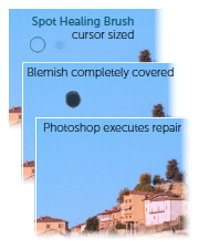
- This tool uses a brush cursor to “paint” over blemishes. Use the bracket keys on your keyboard ([ or ])to shrink or enlarge the brush so it’s a little bigger than those sensor-dust spots. The size is noted near the left end of the Options Bar. I chose a size of about 80 pixels.
- “Paint” over the spot, completely covering it. This identifies the problem. Let go, and Photoshop fixes it!
Even the spot on the roof of the church is fixed easily. If you make a mistake, undo is a quick ⌘-Z/Ctrl-Z.
Lesson D: An Adjustment
At this point, the town image is composed of two layers. If you disable either layer’s visibility, you’ll see only the other. By toggling the visibility of the retouch layer, you’ll enjoy a before and after. We can now perform an adjustment to get the color to its evening glory.
To adjust both layers simultaneously, we will use something called an adjustment layer. If it’s above both the layers that make up our image, it will affect both. Adjustment layers affect only (and usually all) the layers below them.
What’s the Problem Here?
In this image’s case, the issue is with color only, I believe. The image is neither too light nor too dark. That is, there is no tonal problem. Of course, this is Photoshop, so there are several adjustments from which to choose that affect color without affecting tone. We’ll use a wonderfully effective and intuitive one called Photo Filter.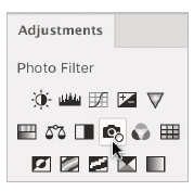
This adjustment simulates putting a colored piece of glass in front of a camera’s lens. Photographers use such filters to colorize the scene in front of them to “warm” or “cool” the scene, for example.
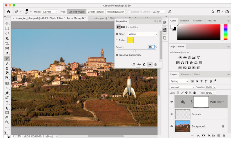
- In the Adjustments panel, click on the icon near the center that resembles a camera. This creates a Photo Filter adjustment layer. Look at the Layers panel. If this new layer isn’t at the top, above the others, drag it there.
The Properties panel should be showing the options available for this adjustment. It also defaults to a classic Warming Filter (85), which simulates a standard 85 filter photographers may carry in their bags. This is a step in approximately the right direction. The blueness is too cold, so warming is right. But this choice is more orange than the yellow we need.
- In the Properties panel, choose Yellow from the Filter menu. To enhance the effect, increase the Density by dragging its slider or scrubbing the word “Density” to about the halfway point. The image now resembles my recollection.
It still needs something to liven it up.
Lesson E: Layers on the Move
Now we’ll take a look at the image called “raptor.psd.” In it, an osprey flies against a blue sky near sunset. It would make a lovely addition to our Italian countryside image. Once this osprey image is added, we’ll go about removing the blue sky to leave only the bird.
Drag, Keep Dragging, and Drop
It’s slightly tricky to use a “drag-and-drop” method of copying a layer to another document, but its speed makes it worth the trouble.
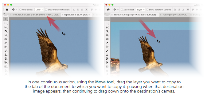
- Choose the Move tool (V) from the Tools panel (it’s at the top).
- Position the cursor somewhere within the image, then, in one go, drag the image to the tab with the name of our destination image (town_too_blue.psd), do not release the mouse when that image appears, continue to drag down onto the destination image, and then release. To repeat: drag the image up to the other tab, pause (without releasing) until the other image appears, drag down into the other image’s document window, and release.
- Double-click the layer’s name to rename it “osprey.”
Or you can use old-fashioned copy and paste if the layer you’re copying isn’t a Background:
- In the Layers panel of raptor.psd, click the padlock on the Background to convert it to a pixel layer. Double-click the layer’s name to rename it “osprey.”
- With that layer highlighted, choose Edit > Copy or use the shortcut ⌘-C/Ctrl-C.
- Go to the destination image, town_too_blue.psd. Highlight the top layer so the pasted one appears above it. Then choose Edit > Paste or use ⌘-V/Ctrl-V to paste.
To remove the sky and leave only the osprey, we’ll have to create a mask. Read on!
Lesson F: Selections & Masking
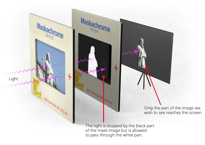
Selections are a big part of Photoshop. They’re how we tell the application which pixels we want to affect. Masks are a means of hiding pixels, areas of an image we don’t want to see. We could delete those pixels, but we might regret it. I make mistakes and change my mind sometimes, and so do my clients. You too? Hiding areas with a mask means we can reveal those pixels if minds change or errors are discovered. That’s why masking is considered a best practice.
Masking Metaphor
Let’s borrow a visual from the “Selections & Masks” chapter of the Compendium. You really should check out “A Metaphor and Example” (page 286) for the full story. But in brief, a mask acts like a kind of light-block that prevents the entire image from being visible. And it does this without damaging the image.
A Warm-Up
Let’s briefly return to the image called “trading faces.psd.” It’s got two layers and, like our Italian scene, the top one needs to lose some content so it can blend in with what’s below.
Basic Procedure to Make a Mask
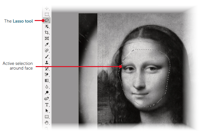
The first thing to do is to indicate which pixels should remain visible. For this image, that will be the central parts of Mona Lisa’s face. In this case, we don’t need high precision, so we’ll select that area with the Lasso tool (L).
- Make sure the “familiar face” layer is highlighted.
- Tap the L key to activate the Lasso tool. Some tools have intuitive shortcuts like that, most don’t. Look at the Tools panel and you’ll see that the Lasso tool is now active.
- Press and drag to draw around the main parts of her face. You don’t need to be too careful this time. But if you really are unhappy with the first attempt, click just once outside your current selection and then try again.
- You now have a selection marquee (nickname: “marching ants”). You’re ready to make the mask.
- Click the Add layer mask button ( ) at the bottom of the Layers panel, or choose Layer > Layer Mask > Reveal Selection. I know it looks pretty bad so far.
- Open the Properties panel. Choose Window > Properties to do so. The Window menu is where all Photoshop’s panels are listed.
Basic Mask Properties
Since you just created the mask, it is targeted, or active. If you look carefully at the Layers panel, you’ll see little brackets around the mask thumbnail that has appeared on the “familiar face” layer. The Properties panel will also indicate that the mask is the active part of the active layer. If you click once on the image thumbnail, the Properties panel will say “Pixel Layer” at the top. Clicking on the mask thumbnail shows the mask’s properties. We’re going to blur (or feather) this mask.
- Drag the Feather slider (or scrub the word “Feather”) until her face is blending in a bit with his head. I find that a value of about 20 pixels works well in this case.
The edges of the familiar face are now translucent, fading away to cause this blending. If you were to disable the visibility of the grumpy face layer, you’d see her face fading into a checkerboard pattern (Photoshop’s way of indicating transparent areas).
When I adjusted Feather, the result was pretty good, except on the left side where some of her hair was still visible.
Take a good look at that mask thumbnail. Notice that it’s black where pixels are hidden and white where they’re shown. If we paint with black on that mask, we’ll hide those last bits. Painting with white reveals pixels again.
Painting on Masks
Again, be sure the mask thumbnail is active.
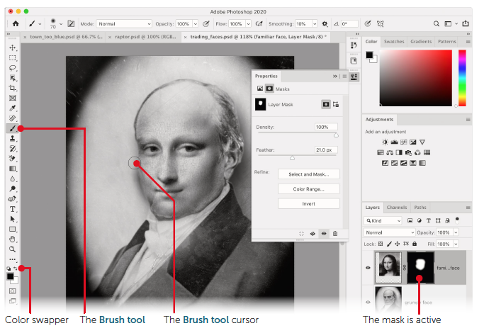
- Choose the Brush tool by tapping the B key.
Note near the bottom of the Tools panel that the Foreground and Background colors are white and black (the defaults). If not, tapping D for “default” makes it so. When you paint, it’s the Foreground color that gets applied. We want that to be black so we can hide the last bits of the Mona Lisa image. If the colors are in the wrong position, click the two-headed arrow near those color chips to swap them, or tap the X key to do so. I told you some shortcuts are not intuitive.
- Ensure the Foreground color is black.
The brush is likely too small if it’s still at its default size. Also, it’s likely a round, fuzzy brush, which is the perfect character for our mask.
- Resize the brush by using the square bracket keys ([ and ]), using the right bracket to make the brush bigger. It appears I went with a brush that is 70 pixels across. You can check the size at the top of the screen in the Options Bar.
- Press and drag to paint along the left side of her face (I suppose it’s her right side, but it’s to our left).
As you paint, it looks like erasure, but the pixels are merely being hidden. If you were to paint with white, they would reappear.
The grumpy face is now obscured by Mona Lisa’s more pleasant, if mysterious, one.
- Choose File > Save, then either choose File > Close or click the small X in the image’s tab.
A Few Possible Methods
Now back to our osprey and quaint Italian hill town in town_too_blue.psd. We need to select the osprey, then, when we add the mask, all else on that layer will be hidden. There are several tools that allow us to select subjects against homogeneous backgrounds like that blue sky around the raptor. For much, much more on the following selection methods, set aside time to peruse the “Selections & Masks” chapter of this book’s Compendium.
- Highlight the osprey layer, then select the Object Selection tool (W; or fourth from the top).
Select Subject
This is a relatively new method. It’s also under ongoing development, so if it doesn’t work as you expect today, try it again when there’s an update to Photoshop.
- When certain selection tools, like the Object Selection tool, are active, the Select Subject button appears in the Options Bar. Click it! If another tool is active, you can access this function from the Select menu by choosing Select > Subject.
- As of this writing, this command does a nearly perfect job. However, it doesn’t quite capture the feathers at the wingtips well enough. Perhaps by the time you read this, it will.
- Since this isn’t quite right, and we wish to try something else, choose Select > Deselect or use the shortcut ⌘-D/Ctrl-D.
Object Selection Tool Intro
- This tool is like a guided Select Subject. Use it to draw a box around the osprey, and it will do a fairly good job as well. But again, it lacks where there are tight twists and turns.
- Since this isn’t quite right, and we wish to try something else, choose Select > Deselect or use the shortcut ⌘-D/Ctrl-D.
Quick Selection Tool Intro
This tool is a little more work. With it, we “paint” over material we want selected and it learns about the colors and textures we’re after. I find that if you paint a little, release, paint a little more, release, etc., it does better than if you try to paint over an entire object at once. This is true, at any rate, for subjects more entangled in their environments than a bird of prey. With this image, you may do well enough by painting continuously over the osprey.
- Right-click on the Object Selection tool to reveal the tools hidden behind it. One is called the Quick Selection tool—choose it. The cursor will be a smallish brush (a circle).
- Keeping the cursor within the bird’s perimeter, paint over its length. Avoid getting too close to the edge of the subject. If the brush touches blue sky, stop, undo, and try again more carefully.
If we were to zoom in and use progressively tinier brush sizes, we would be able to select the osprey very well. However, we should note that the bird is in front of a backdrop that’s very different than it is in color and tone. And just as moviemakers use blue and green screens to isolate subjects and put them in different circumstances, so can we.
- There’s an easier way for this image, so choose Select > Deselect or use ⌘-D/Ctrl-D.
Magic Wand
To use this tool advantageously, we have to know there exists a command that inverts a selection: selecting what wasn’t, and deselecting what was. We note this because the blue pixels and the transparent ones surrounding the bird are very easy to select. We can then invert that selection to have a very precise selection of our subject.
- Right-click on the Quick Selection tool to reveal the Magic Wand tool—choose it. The cursor will resemble the tool icon, a magic wand. Since this is the oldest of these tools, I sometimes call it the Elder Wand.
- Click once on the transparent pixels surrounding the entire osprey layer.
- Then, to add the blue pixels to that selection, hold down the Shift key and click on part of the blue sky around the osprey. You now have a great selection of everything except the bird.
- Choose Select > Inverse. Awesome!
- Click the Add layer mask button (
 ) at the bottom of the Layers panel, or choose Layer > Layer Mask > Reveal Selection.
 - Switch to the Move tool (V) and drag the bird wherever you want it.
Lesson G: Intro to Smart Objects and Filters
Now, just one last thing bothers me. If a bird like that was photographed with a long focal length lens, the backdrop would be somewhat out of focus. If we don’t arrange that, the town in the background competes with the osprey visually. Let’s get eyes to focus on the bird, since it’s the most interesting thing in the photo.
- Highlight the Background in the Layers panel by clicking near its name.
- Holding down the Shift key, click near the name of the retouch layer so its highlighted too.
We’re going to put both of those into a Smart Object, a kind of container layer that can hold many different kinds of data. The biggest benefit to us is that a Smart Object can have many different kinds of effects applied to it that can be edited or removed later if we wish. We’re going to apply one of Photoshop’s many blur filters. Smart Objects and all the various layer types are covered in, you guessed it, the Compendium. Filters too.
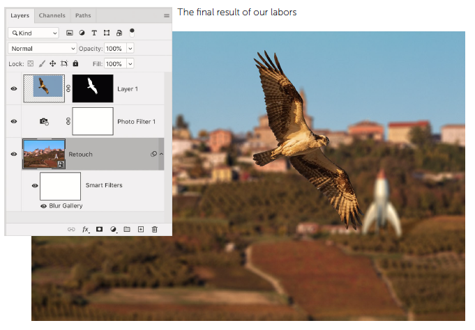
- With both layers highlighted, right-click on either one, then choose Convert to Smart Object. Those layers are now safely inside the Smart Object.
- Choose Filter > Blur Gallery > Field Blur. Don’t be startled as the whole interface becomes dedicated to this function.
In the upper right of the interface, you’ll see a slider for the amount of Blur. At the top of the interface are a few options, including the OK button we’ll use to commit this filter.
- Use the slider or scrub the word “Blur” to get the amount that is pleasing to you. I like it at about 20 pixels for this image.
- Since any noise in the image has been blurred away, giving a too-smooth look, use the lower-right Noise panel to add some grain: about 10% will do for an Amount to match the noise on the osprey.
- Enable the High Quality checkbox at the top of the interface and click OK. When the filter is finished applying, you’ll see it listed under the layer’s entry in the Layers panel.
A Note Regarding Navigation
There will be times when you’d like to zoom in or pan across an image in which you have zoomed. This seems a fine time to cover that. Most tools have a letter that accesses them: B for the Brush tool or J for the Spot Healing Brush tool are examples. Z for Zoom tool and H for Hand tool are two more. However, we rarely want to use those tools for more than a moment, and then only to better see what we’re doing with other tools. Here’s what I recommend:
- Choose a generic tool. A safe one is the Rectangular Marquee tool; tap M to select it. We’re not going to use it, but it doesn’t hurt anything if you accidentally use it.
- Hold down (don’t tap) the Z key and keep holding it! Look at the cursor if it’s over the image. It should resemble a magnifier.
- Keep holding down that Z! With the cursor over the osprey, use your mouse to press-anddrag rightward slowly. You’re zooming in. Leftward is zooming out. Zoom in a good bit. Release the mouse, then (finally) release the Z key.
When you’re done, you should be zoomed on the bird and the active tool should still be the Rectangular Marquee tool. Yes, this does take a little practice. The beauty of this trick is that it works with any tool that has a letter shortcut and that you need only momentarily. Try one more. Since you’re zoomed in, let’s trying panning.
- Hold down the H key (as in “hand”). Drag in the image to explore other parts of it. You’re panning with the Hand tool.
- When done, release the H key.
- To see the entire image, use the shortcut ⌘-0/Ctrl-0 (that’s a zero!).
- Save your hard work (⌘-S/Ctrl-S).
Well done.
