The following excerpt is from Hand Lettering with ProCreate by Liz Kohler-Brown.
Hand Lettering with ProCreate – Why Go Digital?
When I began art school in 2004, I was given a syllabus for each class, which listed the materials I needed to buy. I had totally underestimated the cost of getting an art degree! I was prepared for the tuition and living expenses, but apparently, that was just part of the cost. I also had to purchase hundreds of dollars’ worth of art supplies for every single class, every single semester. I remember so many times being hesitant to start a new painting because I was worried about wasting a sheet of expensive watercolor paper if I were to make a mistake!
How many paintings did I fail to paint because I was worried about wasting money and materials, and how much faster would I have progressed if I hadn’t been overly cautious about making mistakes? For that matter, how much time is spent shopping for the perfect set of brushes or the right kind of paper? It is no secret that art supplies can be expensive, but an overlooked side effect of this is how often it prevents people from creating works of art in the first place. What I love about drawing digitally is that once you buy the device and app, you have every color, tool, and texture at your fingertips without the need for any further financial investment. You also have the ability to create or download unlimited brushes and try them out on unlimited digital canvases. You can freely create new drawings and throw them in the trash as many times as you need to in order to find your personal style. The only time you’ll need actual paper is if you choose to print some of your favorite lettering pieces!
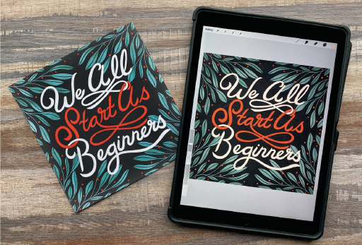
In other words, if you’ve been hesitant to start lettering because you don’t want to waste expensive paper, paints, or ink, then working digitally is a great way for you to gain confidence in choosing colors, designing letter forms, and creating beautiful lettering compositions. Every step in this book is done in the digital illustration app called Procreate, but this doesn’t mean you have to letter digitally forever. The processes you’ll learn in this book can be applied to paper and canvas, and even to the side of a building.
Precision vs. Perfection
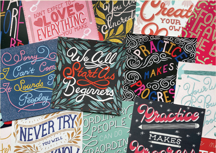
As you complete the projects in the book, remember that hand lettering is not supposed to be perfect. If you want perfection, you could use a tried-and-true font like Times New Roman. What makes hand lettering beautiful is its authenticity and unpredictability, which occurs because of its imperfections, not in spite of them. The widely varying textures, swirls, and idiosyncrasies created by the human hand are what give lettering compositions a personal touch, allowing them to stand out from the mechanical perfection of a font. However, this doesn’t mean hand lettering should be messy. The goal is to set your rules and boundaries for your lettering, and then stay within those boundaries using precise guides and careful attention to detail. If you find yourself obsessing over details and having trouble finishing projects because you think they aren’t perfect, remember that the goal is precision not perfection!