The following excerpt, Making A Black-And-White Image and Creating DuoTones and Tinted Images, is taken from The Enthusiast’s Guide to Photoshop by Rafael RC Concepcion.
IN MY OPINION, you can make a very powerful photographic expression by working in black and white. It’s been said that working in black and white lets you see the “bones of the image,” and I could not agree more. Working with black-and-white images involves a lot more than just removing the color. There are plenty of ways you can make the process of creating a black-and-white image uniquely your own.
Put a check next to Convert to Grayscale in the HSL/Grayscale panel, and your image will immediately turn into a black-and-white image. Under the Grayscale Mix header, you’ll see a series of color sliders that allow you to change the overall look of the black and white image. Dragging one of the color sliders to the right will take all of that color in the image and make it brighter. Dragging it to the left will make the color darker.
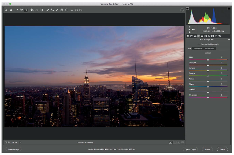
Figure 17.1
This shot I took of the sunset in NYC from the Top of the Rock is nice in color, but I’m looking for a more timeless look. This would be a perfect candidate for black and white.
You can also adjust the brightness of each color by using the Targeted Adjustment tool (Figure 17.2). Activate the tool by clicking on it in the top toolbar, and then click on one of the colors in the picture and drag to the right to make brighter, or drag to the left to make darker.
Directly controlling which colors you make brighter and darker is a great way to make your own black-and-white image, but many people skip over the fact that you can develop this image further by going back to the Basic panel.
The change to black and white often reduces exposure and contrast in an image, or decreases clarity. Once your conversion to black and white is complete, make sure you go back to the Basic panel and reprocess your image to offset any of the changes lost in the conversion. You can then finalize the black-and-white image by adding a little extra sharpness in the Detail panel, and some additional grain in the Effects panel (Figures 17.3 and 17.4).
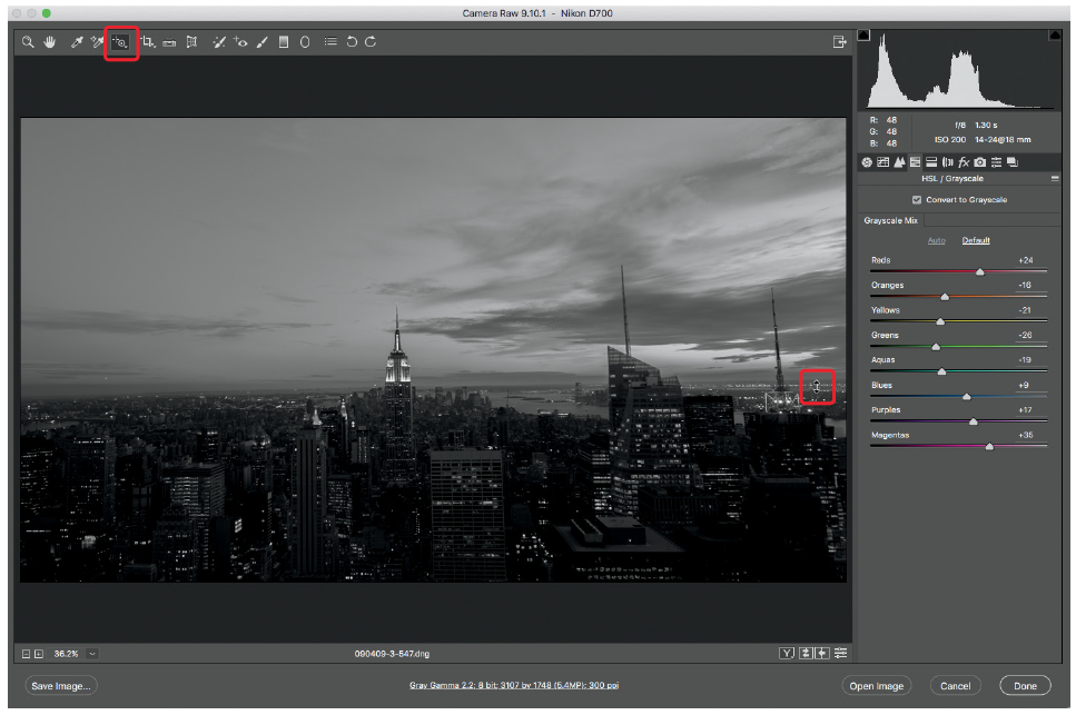
Figure 17.2 I like toning black-and-white images with the Targeted Adjustment tool. Rather than having to think about what colors the sliders control, it’s
a “what you see is what you get” approach.
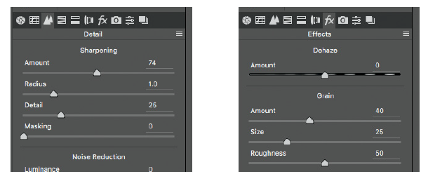
Figure 17.3 Adjust the Sharpness Amount in the Detail panel. Figure 17.4 Adjust the Grain Amount in the Effects panel.
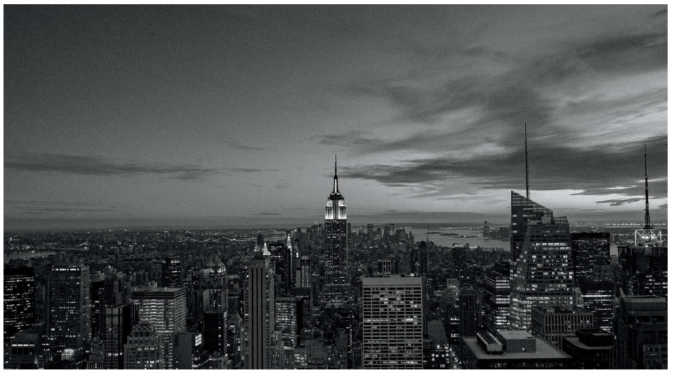
Figure 17.5 This is the resulting black and white changes with some sharpness and grain added to the picture. Because of their timelessness, you’d be
surprised as to how much grain and sharpness you can get away with.
CREATING DUOTONES AND TINTED IMAGES
ANOTHER WAY YOU can give your images a classic look is by tinting them. This process is very straightforward and opens the door to a lot of creative interpretations of your work. Let’s take a quick tour of how tinting works, and then go over a couple of things you should consider when you are making your own custom looks.
The Split Toning panel (fifth icon from the left under the histogram) allows you to change the tint of your image. It contains two settings: Highlights and Shadows (Figure 18.2). These two settings are responsible for the coloring of the highlight and shadow tones in the picture. The Hue and Saturation sliders can be adjusted individually for the highlights and shadows (Figure 18.3). You can also enter values manually in the corresponding fields.
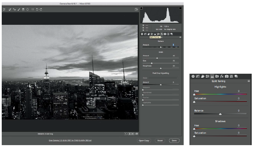
Figure 18.1 We’ll use the previous picture of NYC as our starting point. Figure 18.2 The Split Toning panel allows you to adjust
the tint of an image.
At this point, it’s just a matter of finding the color that agrees with you. As a general rule, I like to start by giving my shadows a little bit of Saturation, and then I’ll set my Hue. Once that’s complete, I’ll move to the Highlights sliders and start again with Saturation. The Balance slider helps create a good look by mixing how the shadows and highlights colors interact with one another in the picture.
When you’re tinting an image in Camera Raw, remember that you are tinting only the shadows and highlights of the image. If you are working with a color image, there will be a little bit of a color bleed in the midtones.
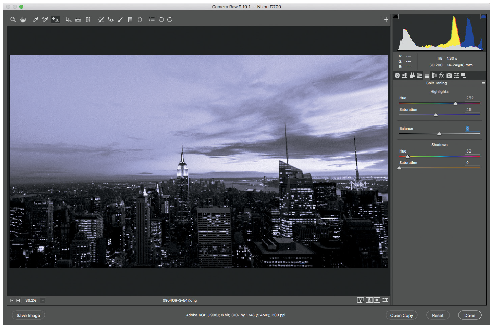
Figures 18.3 Changing the color of the highlights and shadows in an image creates a cool tint look.
If you’d like to eliminate this, I recommend that you make a good black-and-white image before you do any tinting (Figure 18.4). Want to try a quick sepia-inspired tinting? Set your Highlights Hue to 56 and the Saturation to 51; set your Shadows Hue to 62, and the Saturation to 5; and set the Balance to -36, and you’re done (Figure 18.5)!
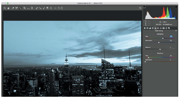
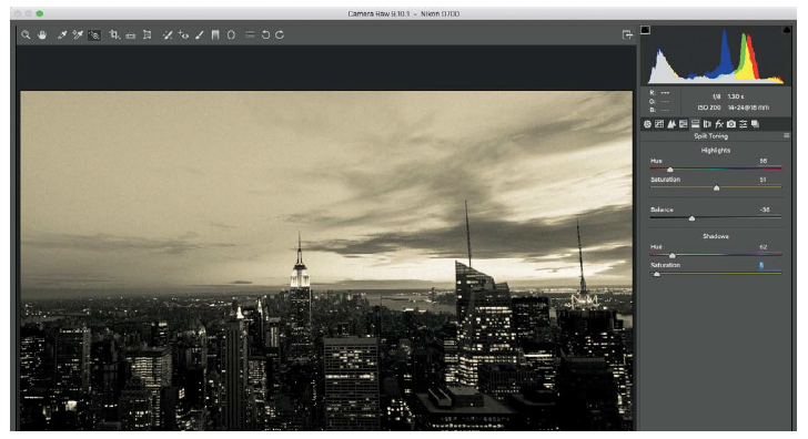
Figure 18.4 Tinted images look much better when you start with a black-and-white image, which is what I did here.
While it seems obvious to use this tool to create a sepia-toned image (everyone tries the sepia look at least once), I like to use the tinting to create a little bit of a different black-and-white image. Once you’ve converted your image to black and white, set your Highlights Hue to 227 and the Saturation to 43; set your Shadows Hue to 62 and the Saturation to 5; and set the Balance to -36. This will give the black-and-white image a little bit of a blue tint (Figure 18.6).
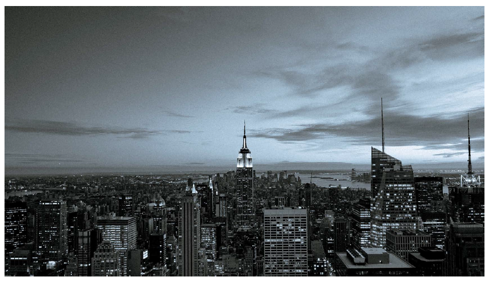
Figure 18.6 Adding a slight blue tint to a black-and-white image gives it a different look.