This excerpt is from the book The Photoshop Toolbox by Glyn Dewis.
In this chapter we’re going to step things up and go through a complete portrait retouch from start to finish so that we can see how techniques work together to produce a final print-ready picture. I mentioned in the beginning of this book that I highly recommend you learn a number of techniques that will give you the same or very similar results because there isn’t one technique that will work well on every picture. Knowing a number of different techniques means that if one doesn’t work well, you can find another in your Photoshop Toolbox that does.
We’re going to start in Camera RAW with the RAW file, but if you use Lightroom feel free to start there because the workflow will be pretty much identical. From there we’ll take our image file into Photoshop. We’ll be working on a photograph of a Royal Air Force Pilot from my on-going 1940s World War 2–themed project. If you’re interested in seeing the behind the scenes documentation showing how I did this portrait there’s a post on my website at the following URL: www.glyndewis.com/raf-1940/.
While we’re on the subject of personal projects, I haven’t mentioned them yet, but they’re something I highly recommend you do. I honestly believe having personal projects has helped me develop my photography and post-production/retouching skills by keeping me excited and always looking to learn more.
Right, enough of my ramblings, let’s get to work…
Download all the files you need to follow along step-by-step here.
CAMERA RAW
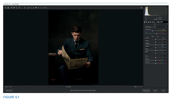
1. Starting in Photoshop, go to File > Open and navigate to the 06_raf.dng file. Because this is a RAW file it will open in Camera RAW (Figure 6.1).
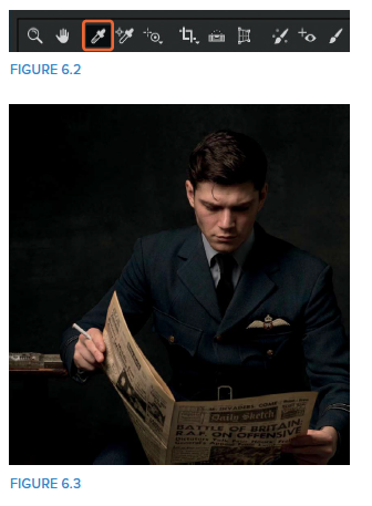
2. Let’s start off by correcting the white balance in the picture. Select the White Balance Tool (Figure 6.2) and click on the gray background. When I did this I clicked just to the side of Lewis’s (the model’s) head (Figure 6.3).
NOTE One thing I get asked quite often is whether I have a set pattern of steps that I follow each and every time I retouch a portrait. The simple answer is no, not really. Sure, there’s always certain things I do, but when I actually do them depends on the image. I tend to look at the image I have in front of me and whatever jumps out at me is what I do first. Then I stop, look at the image again, and then do whatever it is I’m drawn to next. Does that make sense?
The reason I mention this is because the Camera RAW interface, and indeed Lightroom, is arranged in such a way that you could start at the top of a panel and work your way down through the adjustments in order. I just don’t choose to work this way, which again reinforces what I said at the beginning of this book: there’s no right or wrong way to do something; there are just good and bad results.
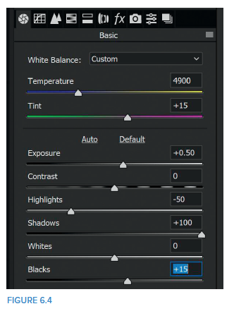
3. I want to see more detail in the shadow areas, so in the Basic panel, move the Shadows slider to the right all the way to +100. Having done that, I think the image actually needs a little more light overall, so take the Exposure slider to around +0.50, which seems to be enough to me. This increases the highlight areas a bit more than I’d like, so drag the Highlights slider to around −50. Then drag the Blacks slider to around +15 to bring in even more detail in the dark areas (Figure 6.4).
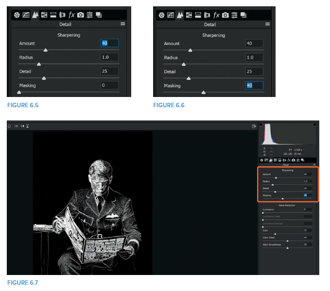
4. We’ll add sharpening to the portrait in specific areas later on to create a particular effect, but I almost always add some sharpening when I’m in Camera RAW or Lightroom, so we’ll do that now. Click to access the Detail panel and in the Sharpening section, drag the Amount slider to around 40, which is what I tend to use for male portraits (Figure 6.5).
5. This sharpens the entire picture, but we only want it to affect Lewis and the table and chair (not the background) because the sharpest area is what the viewer is drawn to. So, just like we covered in chapter 2 on layer masks, we can use the built-in automatic layer masking to restrict where the sharpening is applied.
To do this, hold down the Alt (PC) or Option (Mac) key while moving the Masking slider to around 40 (Figure 6.6). We can see from the preview that this is just about right to ensure that the sharpening (shown in white) is not being applied to the background, but is concentrated on Lewis (Figure 6.7).
I rarely, if ever, make changes to the Radius and Detail sliders—the default seems to work just fine.
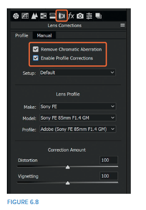
6. Next, go to the Lens Corrections panel and put check marks in the Remove Chromatic Aberration and Enable Profile Corrections checkboxes (Figure 6.8). This is something I always do. I got into the habit of checking the Remove Chromatic Aberration checkbox when I first started using Camera RAW and Lightroom. At the time, I was using lenses that weren’t as high quality as what I use now and would regularly see purple fringing in my pictures. I no longer have this issue (not that I have noticed anyway), but I still always choose to turn on the Remove Chromatic Aberration feature.
I don’t think there is anything else we need to do to the picture in Camera RAW (or Lightroom), so now we’re going to send it over to Photoshop so we can carry on with the retouching.
If we’d made a lot of adjustments up to this point, I’d send the file into Photoshop as a Smart Object. That would mean that if at a later stage we decided that the changes we’d made in Lightroom or Camera RAW weren’t quite right, we could just double-click on the layer in Photoshop to send it back into Camera RAW and fine-tune any earlier adjustments.
However, we haven’t done a great deal to this particular portrait, and if we had to repeat the steps it would take very little time, so at this stage my choice is to send the file to Photoshop as just that, a regular file. However, as always, what you choose to do is up to you; there’s no right or wrong way.
7. Before sending the file into Photoshop, we need to ensure that some settings are in place so that we carry over the very best file. In Camera RAW, directly beneath the picture you’ll see some text that provides information about this particular file (Figure 6.9). This includes the color space, bit depth, pixel dimensions, and pixels per inch (ppi).
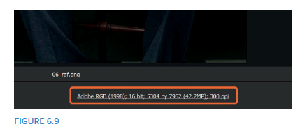
We want to be editing in 16 bit, 300ppi, and my preferred color space is Adobe RGB. There is, of course, the ProPhoto RGB, but we’ll save discussing that for another time.
At the moment I use Adobe RGB because I often send my images to be printed at a lab and Adobe RGB is the color space used by my lab. Editing in Adobe RGB and sending files to the lab in Adobe RGB means that what I see on the screen is what I will see in print (having calibrated my screen, of course).
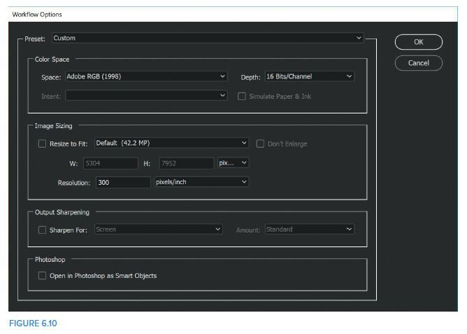
If you want to change the settings, simply click on the text below the image, make your changes in the Workflow Options dialog, and click OK (Figure 6.10).
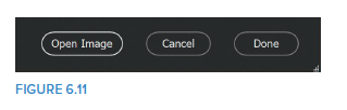
Once you’re happy with the settings, click on Open Image in the bottom-right corner of the Camera RAW interface (Figure 6.11 ).
PHOTOSHOP
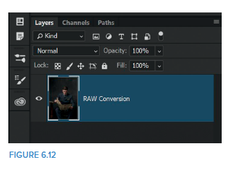
1. With the file now open in Photoshop, let’s rename the layer. Double-click on the Background layer and name it RAW Conversion (as this is the file that we adjusted in Camera RAW) (Figure 6.12).
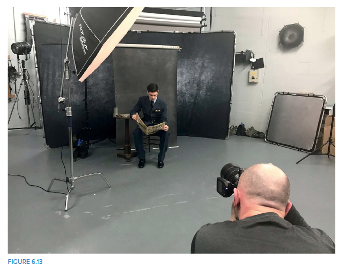
2. If you’ve read the blog post I mentioned in the introduction to this chapter, you’ll have seen in some of the behind the scenes pictures that the canvas background I placed behind Lewis was quite narrow, which is why his arm is close to the edge of the frame in the out-of-camera picture (Figure 6.13).
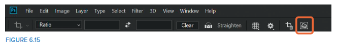
We’ll use the Crop Tool (Figure 6.14 ) to alter the composition so that Lewis is a bit more central in the picture. Select the Crop Tool and turn on the Content-Aware Fill option in the options bar at the top of screen (Figure 6.15 ).
NOTE If you are using an earlier version of Photoshop, you may see a Content-Aware checkbox instead of the icon. For the same results, simply tick this checkbox.
3. Click on the middle crop handle on the right side of the image and drag outward until Lewis’s head is in the middle of the grid (Figure 6.16), then press Enter (PC) or Return (Mac).
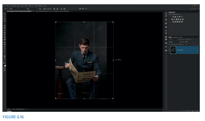
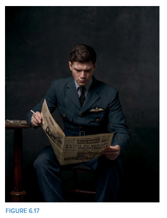
Photoshop will use Content-Aware Fill to fill in the right side of the image by using information in the picture (Figure 6.17 ).
NOTE If you ever have difficulties with Content-Aware where it includes areas that you don’t want, then be sure to check out the “Content- Aware Fill Trick” in chapter 5.
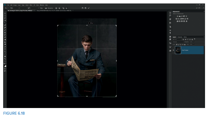
4. Before we move away from the Crop Tool, I want to reduce the amount of space above Lewis’s head and crop out the very bottom of the picture where we can see the end of the canvas backdrop. With the Crop Tool selected, drag the top-middle handle downward (Figure 6.18 ). We don’t need to crop much, but in my opinion, there was too much empty space above his head. Drag the bottom-middle handle up just a touch, and then press Enter (PC) or Return (Mac) to accept the crop.
NOTE You might be wondering why we didn’t crop down from the top at the same time we extended the image to the right. The reason I chose not to was to give Content-Aware as much of the background as possible to use to fill in the empty pixels on the right. If we cropped the top at the same time, we could have restricted the area Content-Aware had to play with.
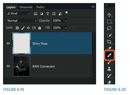
5. With the composition sorted, let’s move on to Lewis. When we zoom in and look at his face, we can see that there is a particularly bright area on his nose. We can reduce this with the Healing Brush. Click on the Add New Layer icon at the bottom of the Layers panel to add a new blank layer to the top of the layer stack, and name this layer Shiny Nose (Figure 6.19).
Choose the Healing Brush (J) from the toolbar (Figure 6.20), and in the options at the top of the screen, set the Mode to Darken and ensure that Sample is set to All Layers (Figure 6.21).
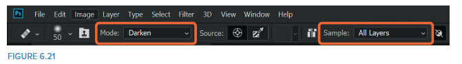
NOTE Setting the blend mode to Darken means that when we use the Healing Brush, it will only darken those areas of the picture that are brighter than the area we use as our sample (source).
We set Sample to All Layers because we are working on a new layer that has no pixels within it. Using All Layers means that the Healing Brush will be able to look down through the layer stack to find pixels to use as a sample area.
Zoom in close to Lewis’s face and then press the left or right square-bracket key to adjust the size of the Healing Brush so that it is just slightly wider than the bright patch on his nose (Figure 6.22).
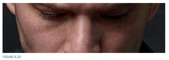
Hold down the Alt (PC) or Option (Mac) key and click to sample an area of skin to the right of the shiny patch on Lewis’s nose. Then use the Healing Brush to cover over the bright area, taking care not to brush over areas of non-shiny skin (Figure 6.23 ).
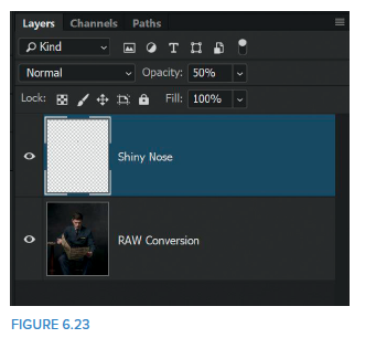
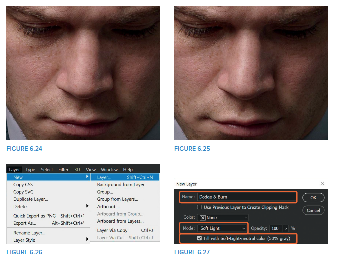
6. Now that we have removed the bright area of skin it looks a little too obvious, so to help it blend in and make it look much more realistic, lower the Opacity of the Shiny Nose layer to around 50% (ish) (Figures 6.24 and 6.25 ).
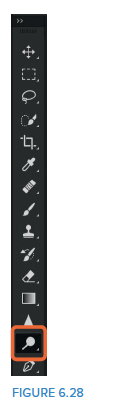
7. Now we’re going to do little bit of dodging and burning to add more depth and dimension to Lewis’s face. Go to Layer > New > Layer (Figure 6.26 ). In the New Layer dialog, name this layer Dodge & Burn , choose Soft Light from the Mode menu, and put a check mark in the Fill with Soft-Light-neutral color (50% gray) checkbox (Figure 6.27 ). Click OK.
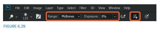
8. Choose the Dodge Tool from the toolbar (Figure 6.28), and in the options at the top of the screen, set the Range to Midtones, the Exposure to anywhere between 5% and 10%, and turn on the Minimize Clipping in Shadows and Highlights and Prevent Hue from Shifting icon (shown as Protect Tones in earlier versions of Photoshop) (Figure 6.29).
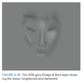
Use the Dodge Tool to paint over areas of Lewis’s face to enhance them, just as I covered in the “Dodging and Burning” section in chapter 4. Hold down the Alt (PC) or Option (Mac) key to activate the Burn Tool with the same settings, and darken the areas on either side of the highlights and the other darker areas of the image.
This is all very dependant on personal taste, but you can see the areas I enhanced in Figure 6.30.
NOTE To see the gray layer, hold down the Alt (PC) or Option (Mac) key and click on the eye icon of the Dodge & Burn layer. To return to normal view, simply do the same again.
9. At this stage of the retouching I like to dive in and use the Topaz Clarity plugin. Plugins are an additional expense, so this isn’t an essential part of the workflow and it may be a step that you don’t want to include. However, I like to use this plugin because it gives me much more control over the contrast and clarity that I add to pictures; rather than a single slider, it has a number of sliders to control the intensity.
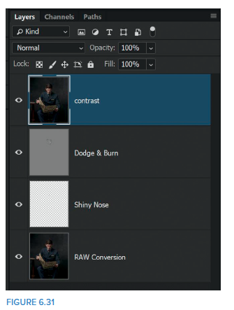
When using the Topaz Clarity plugin, the first thing we need to do is create a merged layer at the top of the layer stack. With the top layer active you can use the keyboard shortcut Shift + Alt + Ctrl + E (PC) or Shift + Option + Command + E (Mac). Rename this layer contrast (Figure 6.31).
10. Now we’ll use the Topaz Clarity plugin to start adding contrast to the fine details of the image, which seems to bring the picture to life. I must admit that despite being familiar with Photoshop, I’ve never been able to replicate exactly the look that Topaz Clarity gives an image, which is why I turn to it time and time again.
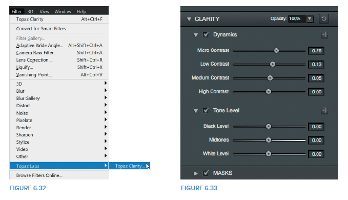
Go to Filter > Topaz Labs > Topaz Clarity (Figure 6.32). In the controls on the right side of the screen, increase Micro Contrast to 0.25, Low Contrast to 0.13, and Medium Contrast to 0.05, and then click OK (Figure 6.33). The amounts you dial in here are completely dependant on your personal taste.
11. The next step is to color grade the picture to give it the right mood. We’ll do this using Color Lookup adjustment layers, which are without doubt my favorite way to colorize my pictures.
Click on the Color Lookup icon in the Adjustments panel to add a Color Lookup adjustment layer (Figure 6.34).
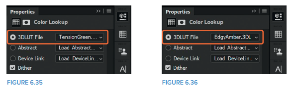
12. In the Color Lookup Properties, select TensionGreen.3DL from the top menu labeled 3DLUT File (Figure 6.35). In the Layers panel, lower the Opacity of this adjustment layer to 30%.
13. Add a second Color Lookup adjustment layer and select EdgyAmber.3DL from the 3DLUT File menu (Figure 6.36). In the Layers panel, lower the Opacity of this adjustment layer to 30%.
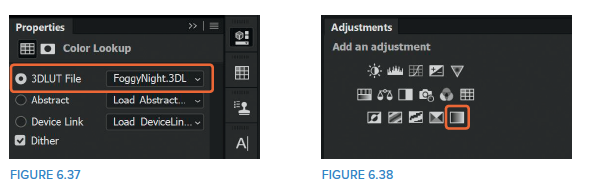
14. Add a third Color Lookup adjustment layer and select FoggyNight.3DL from the 3DLUT File menu (Figure 6.37). In the Layers panel, lower the Opacity of this adjustment layer to 30%.
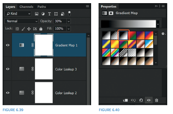
15. When colorizing images we don’t have to just use the Color Lookup adjustment layers; we can use other adjustment layers too. Press D to set the foreground and background colors in the toolbar to their defaults of black and white, and then click to add a Gradient Map adjustment layer (Figure 6.38).
This is a great way to create black-and-white images, but in this case, we’re going to use it to reduce the saturation in our picture. In the Layers panel change the Opacity of the Gradient Map adjustment layer to 30% (Figure 6.39 ).
NOTE Sometimes you might find that despite setting your foreground and background colors to black and white, when you click to add the Gradient Map, Photoshop applies a red gradient or even a white-to-black gradient that makes your picture look infrared. If this happens, don’t worry; all you need to do is go to the Gradient Map Properties and choose the third gradient from the left in the top row, which is Black to White (Figure 6.40)
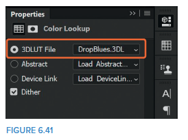
16. Add another Color Lookup adjustment layer and select DropBlues.3DL from the 3DLUT File menu (Figure 6.41). In the Layers panel, lower the Opacity of this adjustment layer to 40%.
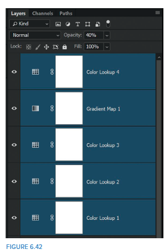
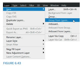
17. To keep the layers organized, let’s put all of the adjustment layers that we’ve added to colorize the picture into a group. With the uppermost layer active, hold down the Shift key and click on the Color Lookup 1 layer so that all of the adjustment layers are selected (Figure 6.42). Then go to Layer > New > Group from Layers (Figure 6.43). Name the group colorize and click OK.
18. Now that we’ve colorized the picture, I’m really loving the feel that it gives to the image, but I’m not so keen on how it’s affecting both the skin tones and the original blue of the RAF uniform. We’ll reduce the colorizing effect on these areas, but we can’t simply reduce the opacity of the group because this will reduce the colorizing everywhere in the picture. Instead we’ll use a layer mask.
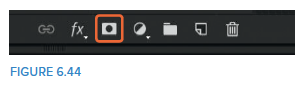
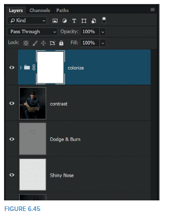
19. Click to add a white layer mask (Figure 6.44) to the colorize group (Figure 6.45). Press D on the keyboard to make sure the foreground and background colors are still at their defaults of black and white. (Press X to swap the foreground and background colors.)
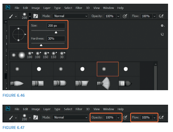
Choose a normal round brush from the toolbar and set the Hardness to around 30% and the size to 200 px (Figure 6.46). (If the brush was completely soft, it would spill over into other areas of the picture as we paint over the edges of Lewis’s face and uniform). In the options bar at the top of the screen set the Opacity and Flow of the brush to 100% (Figure 6.47).
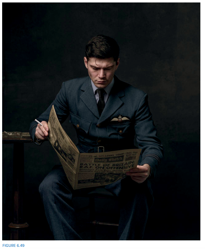
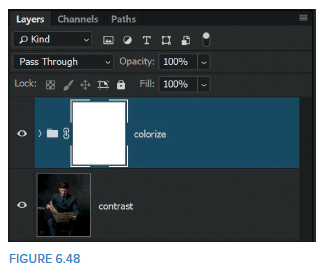
With the layer mask active in the Layers panel (you can see there’s a frame around it Figure 6.48 ) use the black brush to paint over Lewis’s skin and uniform, hiding the colorizing effect from those areas (Figure 6.49 ).
TIP To look for any areas you may have missed when painting on the layer mask, press the backslash key. The areas covered by the layer mask are indicated with a red overlay.
20. Once you have removed the colorizing from Lewis’s skin and uniform, double-click on the layer mask in the Layers panel to open the Properties and reduce the Density slider to 40% (Figure 6.50). Doing this reduces the density of the black on the layer mask so that we can control exactly how much of the colorizing effect shows through.
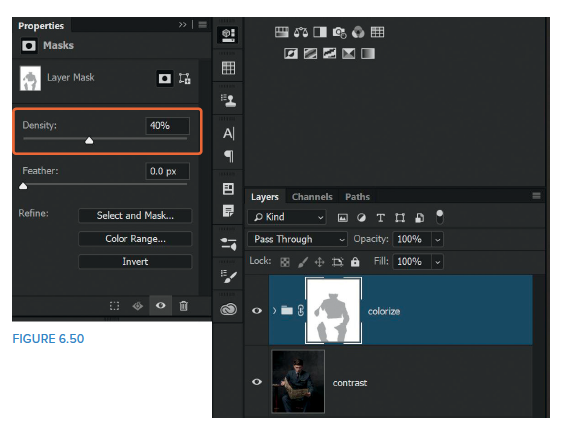
NOTE Using a black brush at 100% and then adjusting the Density slider ensures that the color is removed evenly. You may think of simply painting with a black brush at a reduced opacity, but the danger with that is you can very easily go over areas more than once, which would result in the effect being reduced more in some areas than others.
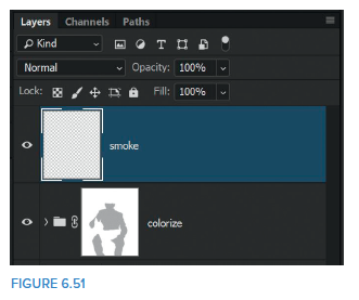
21. Now let’s now add some smoke to the cigarette. We’ll do this using a brush we made in chapter 3, “Brushes.” Add a new layer to the top of the layer stack by clicking on the Add New Layer icon at the bottom of the Layers panel. Name this layer smoke (Figure 6.51).
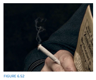
Press D to set the foreground and background colors to their defaults of black and white. We need the foreground color to be white, so press X to switch the foreground and background colors if you need to. Choose the smoke brush from the Brush Preset picker, resize it to around 800 px (or whatever you feel looks right), place it at the tip of the cigarette, and click down (Figure 6.52 ).
22. This looks great, but for added realism we need to add some ash to the tip of the cigarette, which we can do with another brush.
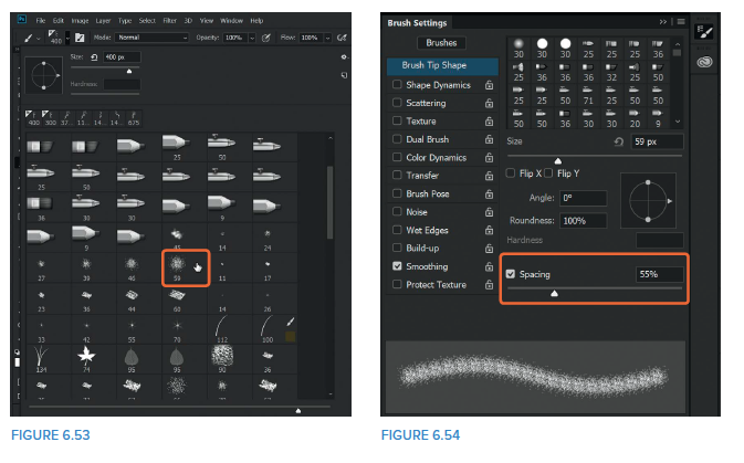
Add a new layer to the top of the layer stack and name it ash . Set the foreground color to black in the toolbar and with the Brush Tool selected, go to the Brush Preset picker at the top of the screen and choose the Spatter 59 Pixels brush (Figure 6.53 ).
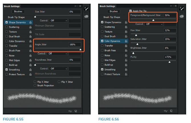
23. Click on the Brush Settings icon in the options bar to enter the Brush Settings panel, and in the Brush Tip Shape section, increase the spacing to 55% (Figure 6.54 ). Click on Shape Dynamics and increase the Angle Jitter to 100% (Figure 6.55 ). Then click on Color Dynamics and set the Foreground/Background Jitter to 50% (Figure 6.56 ).
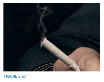
24. Zoom in close to the tip of the cigarette, use the left and right square-bracket keys to adjust the size of the brush, and apply a few brushstrokes to look like ash (Figure 6.57).
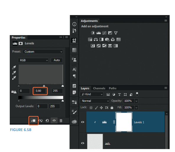
25. To darken the ash, add a Levels adjustment layer and click on the clipping mask icon at the bottom of the Properties panel to add a clipping mask (Figure 6.58). This means that any adjustments we make will only affect the layer directly beneath (i.e., the ash). With the clipping mask in place, move the midtones slider to the right to 0.80.
26. Again, let’s put the layers into a group to keep them tidy. With the uppermost layer (the Levels adjustment layer) selected, hold down the Shift key and click on the smoke layer so that all three of the cigarette layers are selected. Then go to Layer > New > Group from Layers, name the group cigarette, and click OK.
The next few steps are completely optional, but this is a look I tend to add to pretty much all of my portraits to some degree or another. I call it my painterly or waxy effect, mainly because I can think of no other way to describe it.
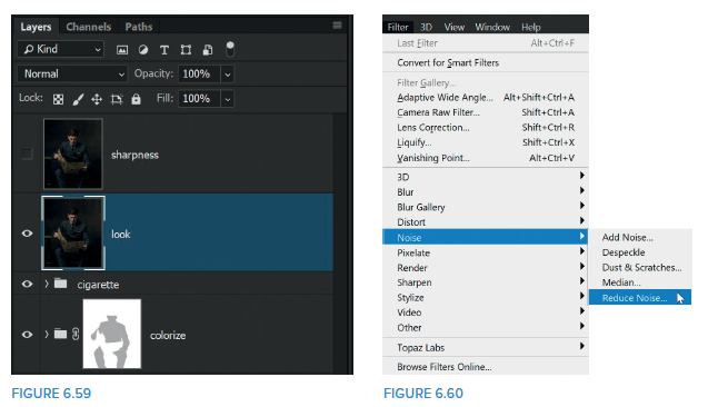
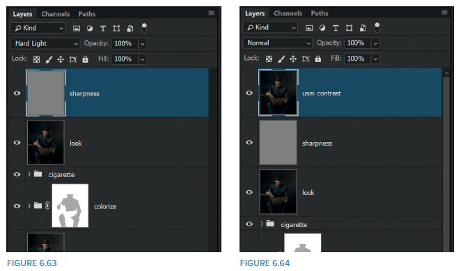
27. Add a merged layer to the top of the layer stack by using the keyboard shortcut Shift + Ctrl + Alt + E (PC) or Shift + Option + Command + E (Mac) and rename this layer look. Press Ctrl + J (PC) or Command + J (Mac) to duplicate this layer and rename the duplicate layer sharpness. Turn off the sharpness layer by clicking on its eye icon, and then click on the look layer to select it (Figure 6.59).
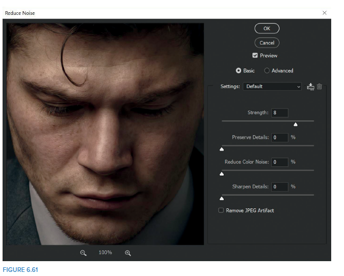
28. Go to Filter > Noise > Reduce Noise (Figure 6.60), and in the Reduce Noise dialog, increase the Strength slider to around 8 and set all other sliders to 0 (Figure 6.61). (You can click and hold in the large preview window to see a “before” version of the image, and then release to see the preview of the image with the effect applied). Click OK.
When applying this effect, you can immediately see the waxy look it gives to the skin; however, you’ll also notice that using the filter in this way reduces sharpness in areas where you might not want it to. The next step resolves this issue.
29. Click on the sharpness layer and click the eye icon to make the layer active. Go to Filter > Other > High Pass, and in the High Pass filter settings dial in a Radius of 1 Pixel (Figure 6.62). Click OK.
30. Change the blend mode of the sharpness layer to Hard Light to remove the gray (Figure 6.63), and you’ll notice that sharpness has returned to prominent areas of the picture. (Click on the eye icon to turn the layer on and off to see the before and after.)
NOTE Using Hard Light to remove the gray from the sharpness layer ensures that the sharpening is contrasty and noticeable. Try other blend modes like Overlay and Soft Light to see how the results differ.
After I apply this painterly, waxy effect I always add more contrast to the entire picture. Of course, Photoshop being Photoshop, there are seemingly countless ways to add contrast, but one technique I like to use involves the Unsharp Mask Filter. I find that using this method allows me to add considerable contrast without noticeable halos or color shift, which can occur with other techniques.
31. Add a merged layer to the top of the layer stack by pressing Shift + Ctrl + Alt + E (PC) or Shift + Command + Option + E (Mac) and rename this layer usm contrast (for Unsharp Mask Contrast) (Figure 6.64).
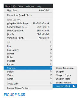
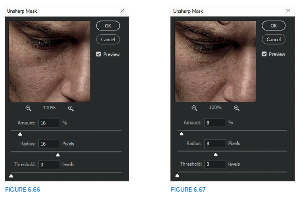
32. Go to Filter > Sharpen > Unsharp Mask (Figure 6.65), and in the Unsharp Mask dialog, set Amount to around 16% and use the exact same for Radius. Keep Threshold set to 0 (Figure 6.66). (Again, click and hold in the preview window to see a before and after.) Click OK.
NOTE For best results when using the Unsharp Mask filter to add contrast, be sure that you use the same number for Amount and Radius. I always set Threshold to 0.
I use contrast and light to give my portraits added depth and dimension, making it feel almost like they are coming toward the viewer. This becomes very evident when the pictures are printed, especially on metal.
33. Add another merged layer to the top of the layer stack by pressing Shift + Ctrl + Alt + E (PC) or Shift + Command + Option + E (Mac) and rename this layer usm face. Then go to Filter > Sharpen > Unsharp Mask, and this time in the Unsharp Mask dialog, reduce the previous Amount and Radius by half (so this time Amount 8% and Radius 8 Pixels) (Figure 6.67). Click OK.
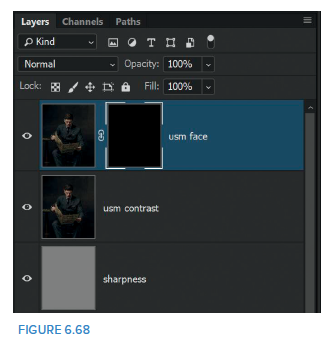
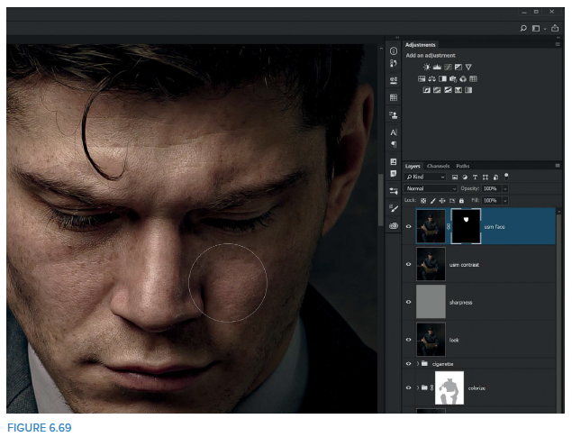
34. Add a black layer mask to the usm face layer by holding down the Alt (PC) or Option (Mac) key and clicking on the Add Layer Mask icon at the bottom of the Layers panel (Figure 6.68). This hides the result of the previously applied Unsharp Mask filter so that we can use a white brush to reveal it on only the face.
Use a normal round, soft-edged brush with a white foreground color and 100% Opacity to paint over the face, revealing the Unsharp Mask contrast in this area only (Figure 6.69).
At this stage, I’d probably walk away from the screen for a while to give my eyes a break. Getting into the habit of doing this is one of the best pieces of advice I received a few years back from my friend Matt Kloskowski. It enables you to look at your picture with fresh eyes and immediately see what needs to be done. This break can be as short as five minutes; just be sure to take a break.
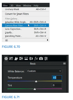
35. The last thing to do involves diving into the Camera RAW filter. Add one final merged layer to the top of the layer stack and rename this layer Camera RAW. Then go Filter > Camera RAW Filter (Figure 6.70).
36. What I do in Camera RAW is again very much down to personal taste, but to give you an idea, I’ll walk you through what I did in the original retouch of
this image:
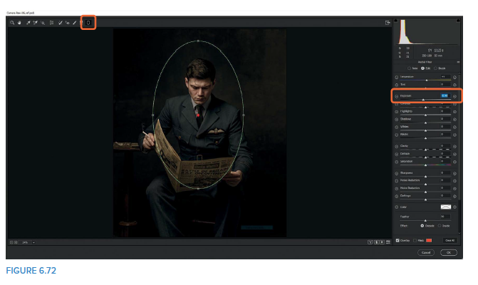
• Increase the Temperature to +5 to warm up the image a little (Figure 6.71).
• Add a Radial Filter and position it to include the top half of Lewis, then reduce the Exposure slider to – 0.40 (Figure 6.72).
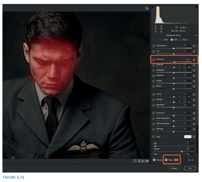
• Use an Adjustment Brush to add a little light to the face and draw the viewers’ attention toward it. Choose the Adjustment Brush Tool (K), set the Exposure to around +0.20, and brush over Lewis’s face. Turn on the Mask checkbox so you can clearly see where you have brushed (Figure 6.73).
• Once you’ve painted over the face, uncheck the Mask checkbox, and then dial in the Exposure until you’re happy with the amount of light on Lewis’s face. For me, +20 was enough.
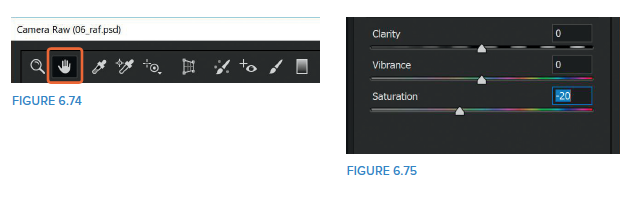
• Finally, select the Hand Tool (Figure 6.74), click on the Basic tab, and reduce the saturation of the picture by dragging the Saturation slider to around – 20 (Figure 6.75). Then click OK to return to the main Photoshop workspace.
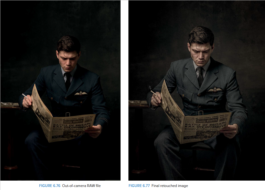
So there you go: a complete workflow taking a picture from it’s RAW “out of camera” state to printready, making use of layer masks, brushes, and blend modes along the way.
As I said at the beginning of this book, Photoshop is a HUGE piece of software, which in some ways is a great thing because it offers so much, but in other ways can make it a little daunting. However, no matter what is currently in Photoshop and what is introduced in the future, at the core are layer masks, brushes, and blend modes.
I truly believe that with a little bit of understanding and a willingness to experiment and approach Photoshop with a mindset of “What would happen if…?!?”, the sky literally is the limit.
Keep enjoying the process,
Glyn