The following is an excerpt from Adobe Photoshop Course and Compendium, 2nd Edition by Steve Laskevitch.
Lesson D: Vibrance & Hue/Saturation
There are several adjustments that affect the saturation of an image, and in this lesson we’ll discuss two. As always in this book, you’ll learn the foundations and rationale here and then you can deepen your knowledge in the Compendium. For this lesson, the good parts to reference are “Vibrance” (page 242) and “Hue/Saturation” (page 243).
Definition of Saturation
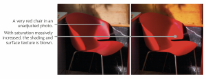
Saturation is a measure of the purity of a hue. Think of the light from a laser. It’s impressively intense and vibrant—its color is purely of one wavelength, the ultimate saturated color. The color of an old incandescent bulb is a mix of yellows, reds, and oranges. Since it’s not as pure a hue as the laser, we’d say it’s less saturated. Full-spectrum lights produce a color that is pretty much completely unsaturated: all the visible hues are blended together as white light.
Color Clipping
An image with no saturation is grayscale. Each hue in a heavily saturated image is pure but without gradation of color. We call this “color clipping,” and it’s generally avoided. It can also occur when outputting an image: depending on the settings used, colors that didn’t clip on-screen may clip in print, or colors that aren’t clipped on one display may clip on another. The Vibrance adjustment has two sliders: Vibrance and Saturation. The Hue/Saturation adjustment also has a Saturation slider, but it behaves (I’d say misbehaves) very differently from the identically named one in the Vibrance adjustment. Let’s try them both. We’ll use the same image so you can compare.
Vibrance
- Open the file called “D Vibrance Hue-Saturation.psd” from the “02 A Few Adjustments” folder. This image has both muted and gently saturated colors.
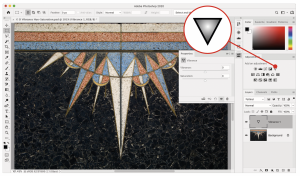
- Create a Vibrance adjustment by clicking its icon in the Adjustments panel. Compare the sliders in the Properties panel.
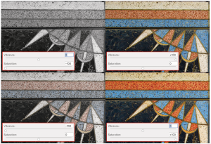
The Vibrance slider more strongly aff ects the least-saturated colors so it avoids clipping colors that started out more intense. It also avoids oversaturating skin tones. The Saturation slider is much stronger but shows some restraint. When lowered, it can remove all color from the image. This is also true with the Hue/Saturation adjustment with which users used to customize grayscale conversions.
Double-clicking the name (label) of a slider resets that control to 0.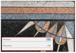
By increasing the Saturation and reducing the Vibrance, you can remove color from nearly neutral areas. Note here how the yellowed white stone is made to look cleaner while the red and blue areas mostly retain their color.
- Click the eye icon to the left of the Vibrance adjustment layer in the Layers panel to disable it for now. Don’t delete it, as you may wish to compare it with our next adjustment.
Hue/Saturation
- If you closed it, reopen the file called “D Vibrance Hue-Saturation.psd.”
This adjustment can aff ect saturation, as you would guess, but it can also shift hue and aff ect lightness (tone) in an image. Remember the color wheel we saw earlier? Shifting hue means turning that wheel—either slightly or drastically. Let’s experiment a bit, then we’ll do something practical.
 Create the adjustment by clicking its icon in the Adjustments panel. Resize the Properties panel if necessary to see all its controls.
- First, let’s try out the Saturation slider, moving it all the way to the right. Note how merciless it is compared to the sliders in the Vibrance adjustment. Now you know why those were invented! However, if used modestly, this one can do some good too.
- Double-click the name (label) of the Saturation slider to reset it to 0.
- Try the Hue slider.
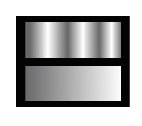
Please note that dragging it either way to the end gets you to the same place: the other side of the color wheel! The numbers are a hint too: 180 or -180, as in 180˚. Watching the color strips at the bottom of the panel is helpful to see how the current hues (top strip) become shifted to the hues directly below them. Each strip is essentially a color wheel snipped and flattened.
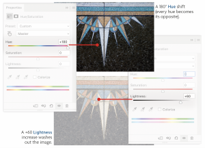
- Try the Lightness slider. A bit blunt, isn’t it? It will behave more nicely in the next context.
If you aren’t impressed yet, that’s alright. Th ere’s a really cool feature that you may fi nd more exciting. You can adjust these attributes for each hue. Th at is, you can adjust the hue, saturation, and/or lightness of just blues, for example. Let’s do that.
- Click the Reset button (
 ) for a fresh start.
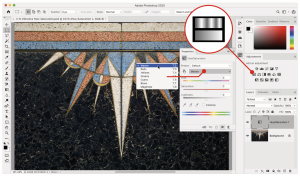
Note the menu with the word Master chosen and the small pointing hand to its left. These are two ways of choosing the hue you want to adjust. The menu seems fairly straightforward: if you want to adjust blues, you choose Blues from the menu.
![]() That little hand resembles a scrubby cursor, the one you see when you hover over a field’s label. Just hover the cursor over the word “Hue” or “Saturation” to see what I mean. Well, this tool can be used like that.
That little hand resembles a scrubby cursor, the one you see when you hover over a field’s label. Just hover the cursor over the word “Hue” or “Saturation” to see what I mean. Well, this tool can be used like that.
- Click the pointy finger icon (an on-image adjustment tool) to make it active. When you hover over the image, however, it looks like an eyedropper. That’s OK.
- Click on a blue pixel with the tip of the eyedropper (its lower-left end). Unless you missed, the hue menu now reads Blues and a small interface has appeared between the hue strips at the bottom of the Properties panel (it’s also called the Hue slider). It’s terrible to have two things with the same name, but there it is. I’ll call it the “Adjusted Hue Indicator.”
The blues in the image don’t exactly correspond to Photoshop’s defi nition of blue. (On Photoshop’s color wheel, blue is at the angle of 240˚. That will be useful knowledge soon.) But let’s continue for a moment as if our blues are their blues.
- Continue to use the on-image adjustment tool (
 ) dragging on a blue part of the image. You’re adjusting the saturation of that hue (note that the Saturation slider is moving when you do this).
 - Drag on blue pixels while holding down option/Alt. Th e Saturation slider moves more slowly and carefully.
- Drag on blue pixels while holding down ⌘/Ctrl to move the Hue slider. Hold down ⌘-option/Ctrl-Alt to move the Hue slider more slowly.
As long as you press and drag on pixels that are within Photoshop’s defined range for that hue, this will work. Dragging on a reddish pixel will change which hue you’re adjusting entirely.
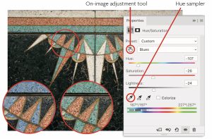
To precisely target the right range of hues for the image, there’s another tool to enlist: the Hue sampler. It’s the fi rst eyedropper near the bottom of the Properties panel.
- Activate the Hue sampler by clicking its eyedropper icon. Click on a distinctly blue pixel in the image. If that is diffi cult to do, turn on your keyboard’s caps lock for a precise cursor. Try to remember to turn off caps lock later!
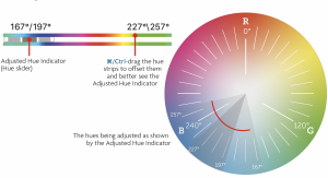
The Adjusted Hue Indicator (officially, another thing called the Hue slider) has shifted to the left, closer to cyan. If it’s wrapping around to the other end, ⌘/Ctrl-drag the hue strips to off set them. The central part of that indicator is under the hues that will be fully adjusted, the outer parts are under those hues that will be partially adjusted. The numbers above the hue strips show the exact hue angles on the color wheel that are being affected. Check out the diagram below.
- Save your work (⌘-S/Ctrl-S) and close the document.
If you’d like to learn even more about this adjustment, see “Hue/Saturation” (page 243). Yes, there’s more! In fact, now that you understand the approach to using adjustment layers, you can explore the other adjustments too. Use the “Adjustments & Color” chapter of the Compendium as your guide.