This is an excerpt from Chroma by Nick Fancher.
I was in Charleston, South Carolina, for my annual shoot with the 34 West theater company. Every fall I return to this historic city to photograph the company’s Friday evening performance and then shoot the promo material for their upcoming season the following morning. As I was photographing their performance that night, I noticed the colorful shadows created by the stage lights (Figure 3.11). I loved the way the colored lights looked on the orange curtain. It made me think of Miles Aldridge’s shoot with the Game of Thrones cast for Time magazine (look it up if you’re not familiar). That night, after the performance had ended, I asked the actors if they had any additional curtains in other colors. To my delight, they had half a dozen varieties in storage, and I knew immediately that I would have to imitate Aldridge’s shoot.
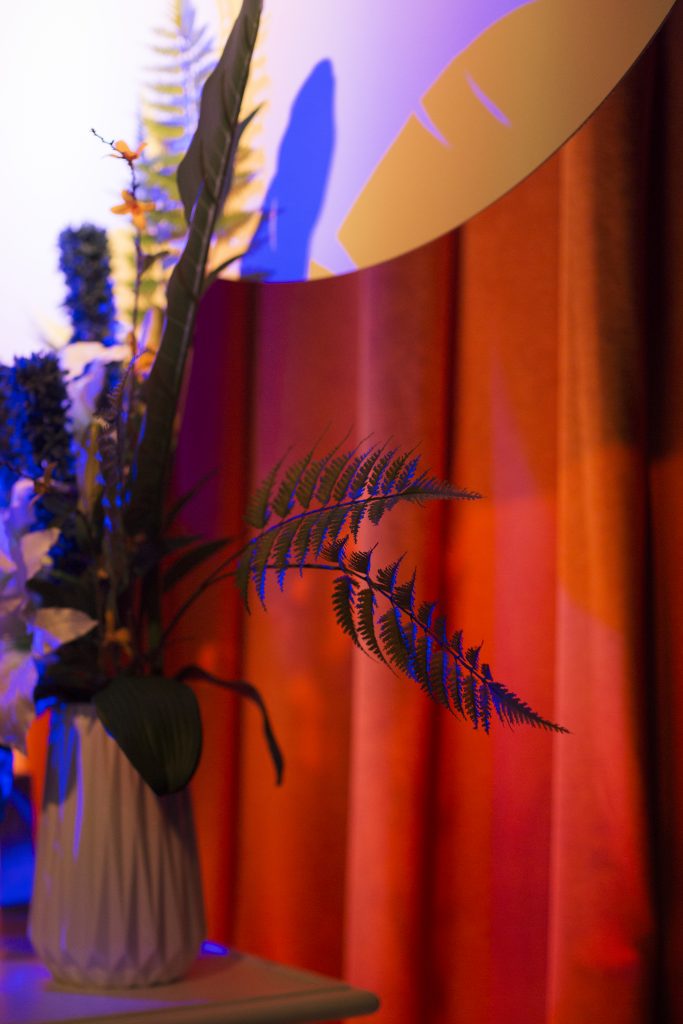
Figure 3.11 I was inspired by these colors and shapes at the theater performance.
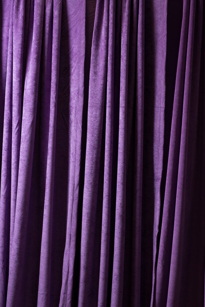
Figure 3.12 We picked this vibrant purple fabric to use as a backdrop.
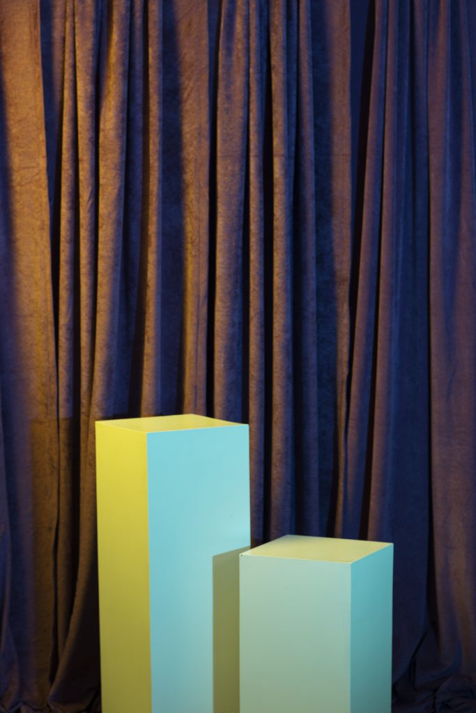
Figure 3.13 I added white boxes to the shot to see how my gelled lights would interact with both the subject and the colored background.
We worked through our shot list the next morning, making sure to leave an hour at the end to play with color. We started by hanging a vibrant purple curtain (Figure 3.12). I added white boxes to my scene in order to see how my colored lights would interact with both the subject (once they were dressed) and the background, Figure 3.13.
I ended up going settling on cyan and yellow gels for my lights. I placed the yellow light to the left and cyan to the right, both at relatively extreme angles to the fabric. The extreme angle of the lights to the curtain accentuated the folds of the fabric rather than flattening them out, as they would if the lights were shining directly at the curtains.
In Figure 3.14, you can see the cyan layer of light; you can see the yellow layer of light in Figure 3.15. The yellow interacted with the purple to make a gold/brown color, while the cyan pushed the purple fabric to a royal blue. Since the yellow light was at slightly more of a side angle to the backdrop, it didn’t light the deep folds of the fabric, only the surface. The cyan light, which was slightly more frontal, not only filled in the fabric’s shadows, but helped neutralize the overall yellow/brown color on the curtain’s surface, save for where the subject blocked the cyan light, creating the yellow background shadow seen in Figure 3.16.
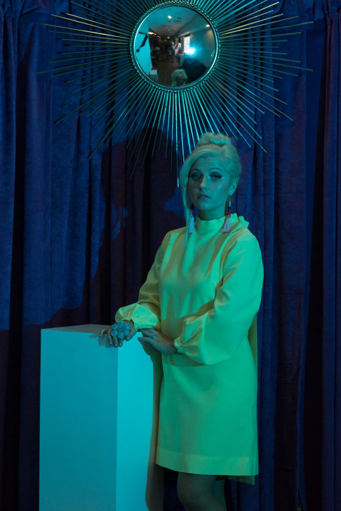
Figure 3.14 This is the cyan layer of light. It is slightly frontal, and doesn’t create many shadows.
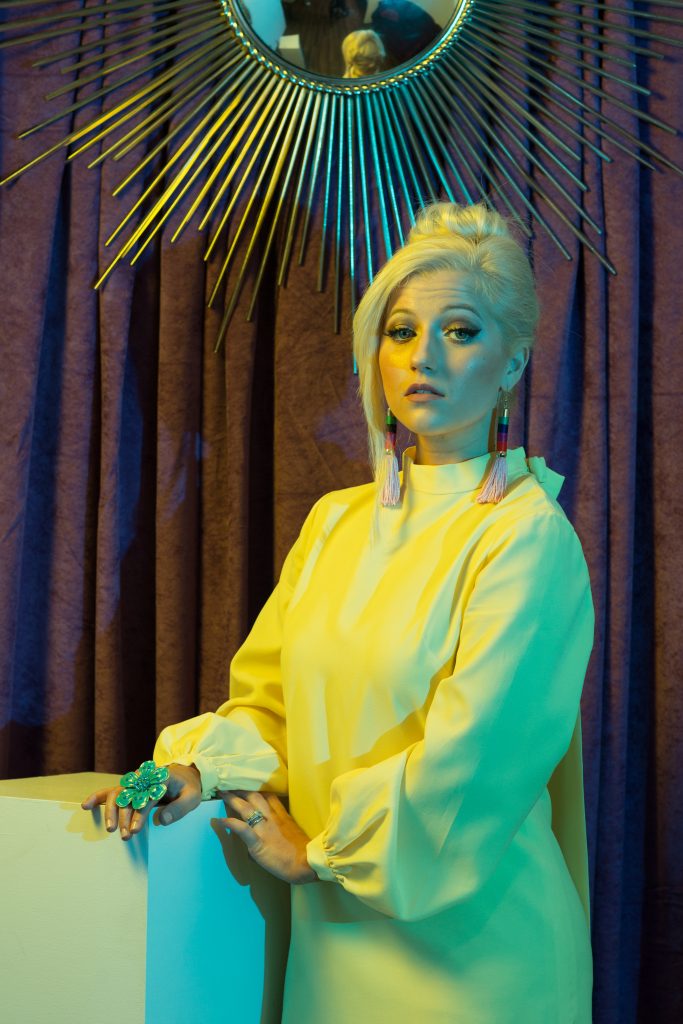
Figure 3.16 This is the RAW file with both cyan and yellow layers of light.
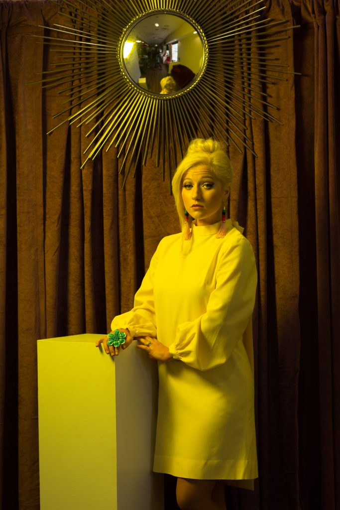
Figure 3.15 This is the yellow layer of light. It is a bit more side-angled, and highlights more of the fabric’s folds.
One more quick plug for my Cactus system (no, they’re not paying me to promote them): Though I’m sure they’re not the only system to offer this feature, the fact that I can turn each light off and on with the click of a button from the transceiver on my camera (I put each light on its own channel) is a game-changer for me. It’s not only convenient and an energy saver (no more countless trips to and from my light stands to take test shots and make adjustments). It also encourages me to experiment and accelerates the learning curve. By building up colors in a scene one at a time, I can better understand how the different colored lights interact with each other or with different colored surfaces or skin tones. Not to mention, I can also get several unique lighting setups just by turning a background or accent light on or off, which is invaluable when working on a tight timeline.
Since the yellow and cyan gels are similar in value (they are less dense, meaning more transparent), I set both lights to the same output (Figure 3.17). My Lightroom workflow for this setup was very basic (Figure 3.18). Aside from making a radial adjustment to bump up the brightness on the actress’s face, all I did was make curve adjustments. I also made a brush adjustment to the mirror, darkening the reflection. The final image references is inspired by the Renaissance style, with the addition of modern elements (Figure 3.19).
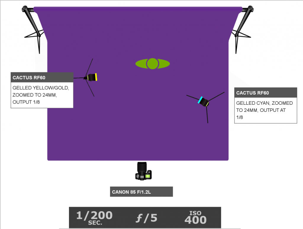
Figure 3.17 The lighting diagram. Since the gels were similar in brightness, the lights were set to the same output.
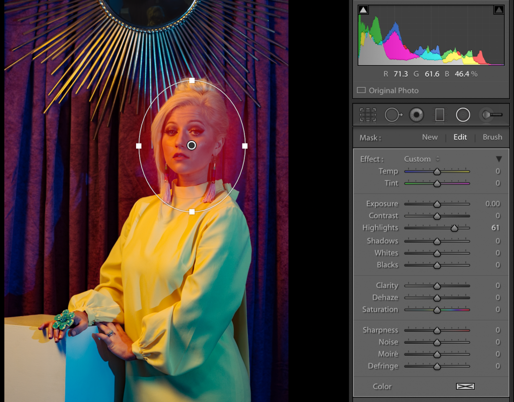
Figure 3.18 The Lightroom settings. All the color grading was done using the tone curves.
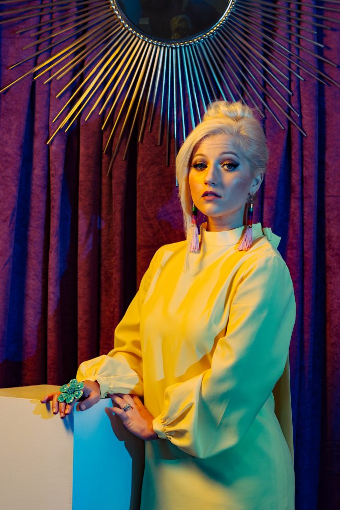
Figure 3.19 The final image. It references the Renaissance style while also adding more modern elements.