The following article on Composition is an excerpt from Make Great Photos by Alan Hess.
The composition of your images (what you decide to leave in the image and where you decide to place it in the frame) makes them uniquely yours. After you have made the lens (or focal length) choice, it is up to you to figure out what the photo is going to be.
Where to Place the Subject, and Why
There are some compositional rules that I’m sure you know and may have even tried. Here are some guidelines and how I have used them to strengthen my compositions. We will start with the most often quoted, the rule of thirds.
The Rule of Thirds
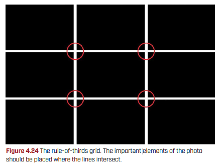
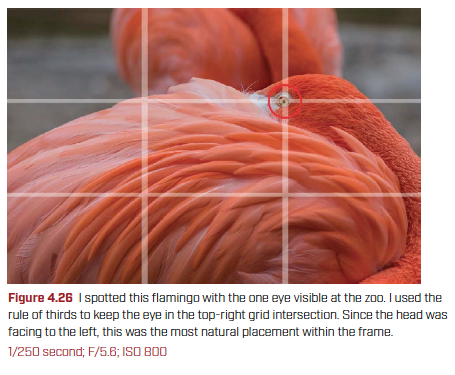
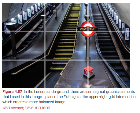
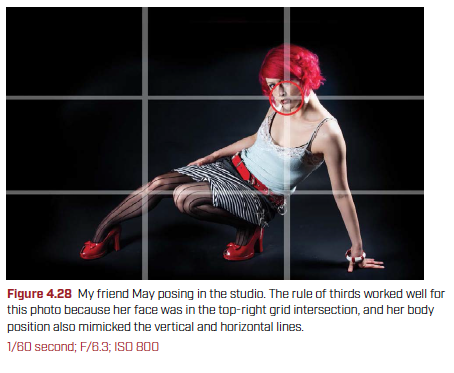
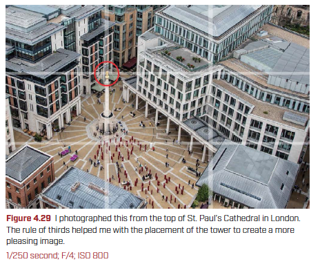
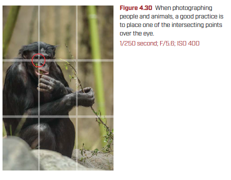
The rule of thirds might be the most talked about compositional “rule” in photography, and for good reason: it helps people get better images, it’s really easy to understand and implement, and once you understand what the rule does, you can choose to ignore it. The rule of thirds is where you divide the scene with two parallel vertical lines and two parallel horizontal lines to create nine equal sections, and you place the important elements of your composition where the lines intersect (Figure 4.24).
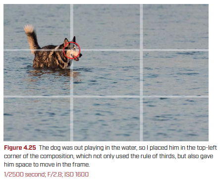
I have been using, or at least thinking about, the rule of thirds for many years now. It has become part of my process when I look through the viewfinder. My first thought is to place the important elements of the photo to align with one of the four intersection points. Figures 4.25–4.30 use the rule of thirds, as you can see with the graphic overlay.
The Horizon
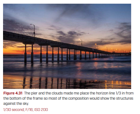
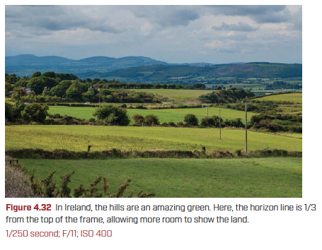
The rule of thirds can also be used to create a stronger landscape image because it can show you where to place the horizon. The easy rule is that the horizon should be either 1/3 from the top or the bottom of the composition, and you make that decision based on which is more interesting: the sky or the ground. If the sky is more interesting, then the horizon should be 1/3 from the bottom, giving more of the frame over to the interesting sky (Figure 4.31). If the ground is more interesting, then more of the frame needs to show that, so the horizon is 1/3 the way from the top (Figure 4.32).
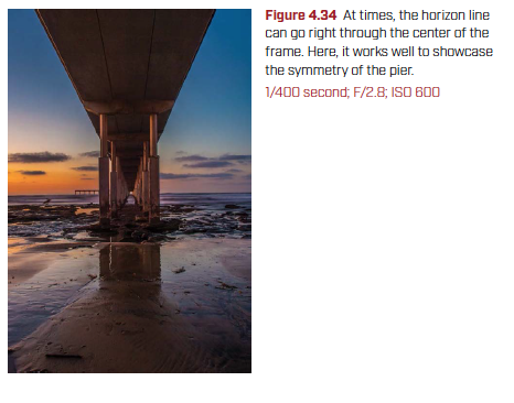
Dead Center
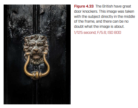
When I first picked up a camera, there was no autofocus. You needed to turn the focusing ring on the lens until the image was in focus. Cameras used a split screen: in the center of the frame, the image was spilt, and when the two halves of the image aligned, the subject is in focus. The downside to this was that for many years, even after autofocus was introduced, I kept placing the subject of the photo right in the middle of the frame. There isn’t anything wrong with this, but it can be a little boring.
There are times when placing the subject in the middle of the frame can really work, especially when it gives the subject some impact. When you do this, try to make sure that the image looks symmetrical and balanced (Figures 4.33 and 4.34).
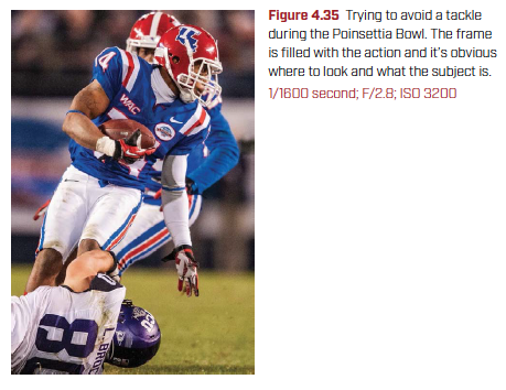
Fill the Frame
Filling the frame means getting close to your subject and having it fill most of the photo. (Try to avoid leaving unimportant information in your photograph—it can be distracting and may reduce the effectiveness of the image.) This is particularly useful when shooting sports. In Figure 4.35, I used a 400mm f/28 lens to get as close to the action as possible to fill the frame. You can see the player with the ball, the players trying to steal the ball, and nothing else.
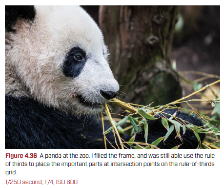
This compositional guide is especially useful for folks sharing photos on social media and for photos viewed on smartphones and tablets. The small screen and most people’s short attention span means that people don’t spend a lot of time looking at each photo, so you need to make sure that people can see the subject and don’t get distracted by anything else in the frame (Figure 4.36).
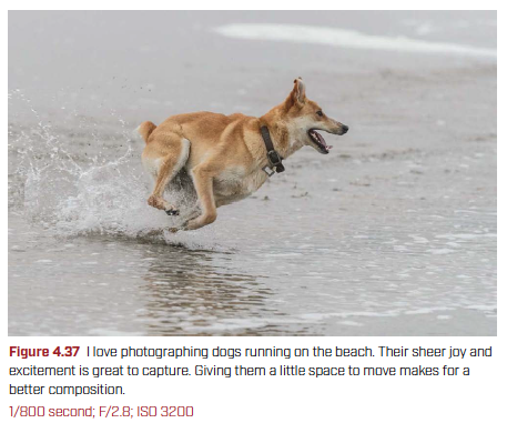
Space to Move
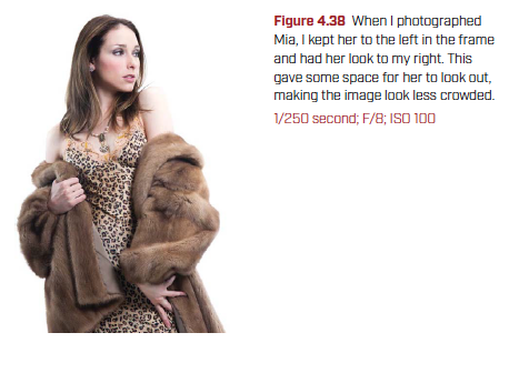
Leaving some space for your subject to move in the frame makes your photographs look more natural. This is particularly true if the subject is moving when you photograph it. Take the dog running on the beach in Figure 4.37. By having more space in front of the dog and less behind it looks more natural. This is also true when you have a person (or animal) looking to the left or right: leave space where the subject is looking so they don’t look like they’re staring out of the frame (Figure 4.38).
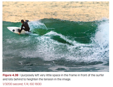
The opposite of having space to move is when the action butts right up against the edge of the frame. This can make the viewer feel uncomfortable for no good reason because it heightens the tension in the photo. Once you see how the subject having space to move works, consider trying a shot where the subject is right up against the edge of the frame, like the surfer in Figure 4.39.