Family Portraits – Techniques to Flatter Everyone February 16, 2017 – Posted in: Photography – Tags: Flatter, Lindsay Adler, Photographer's Guide to Posing, Photography, portrait, Pose, Poses, posing, Techniques
FAMILY PORTRAITS
A successful family portrait means paying attention to the big picture as well as to the small details. Are you flattering each individual? Have you created body language that shows affection and intimacy? Have you created a balanced composition with visual flow for the eyes?
If you think of each individual part at once, it may seem overwhelming. As with any major task, it becomes more manageable when you break it down into smaller steps.
In my five guidelines for posing families, I will show you how to build a family portrait so that you flatter each person, create dynamic shapes with body and head placement, create a balance to your images, and more.
Guidelines for Posing Families
In a family portrait, your composition is the placement of your subjects. Let’s take a look at the elements that work together for successful family portraits.
Build with Triangles
With family portraits, triangles are your best friend. After reading this chapter and taking some practice shots, triangles will begin to appear before your eyes!
When posing a family, avoid having the heads in a line either vertically or horizontally. Having them all lined up either looks like a totem pole or a criminal lineup—neither is particularly desirable for a family portrait. Furthermore, when the heads are all lined up, the image lacks visual interest and flow. The eye enters the frame, moves across the line of heads, and then exits the frame. There is nothing to hold the viewer’s interest. It’s like an image of a person standing as straight as a column—boring!
For every shot, there are multiple options for placing each person, plugging in empty space in the image, and building triangles. These solutions apply whether you’re shooting three people or 13 people. Each additional family member in the composition will create even more triangles.
When you start to see the triangle options, you’ll always know where the next person should go to maintain balance. We will discuss this in the next guideline, but first, let’s take a look at what I mean by triangles.
In FIGURE 9.1, the women’s heads are lined up vertically, and the pose looks awkward. Everything is a bit too stacked. Your eye enters at the top of the frame and exits at the bottom without any flow.

Figure 9.1 – Avoid lining heads up vertically. Instead, seek to place heads in a way that creates a triangle. This creates more interest and flow in the composition.
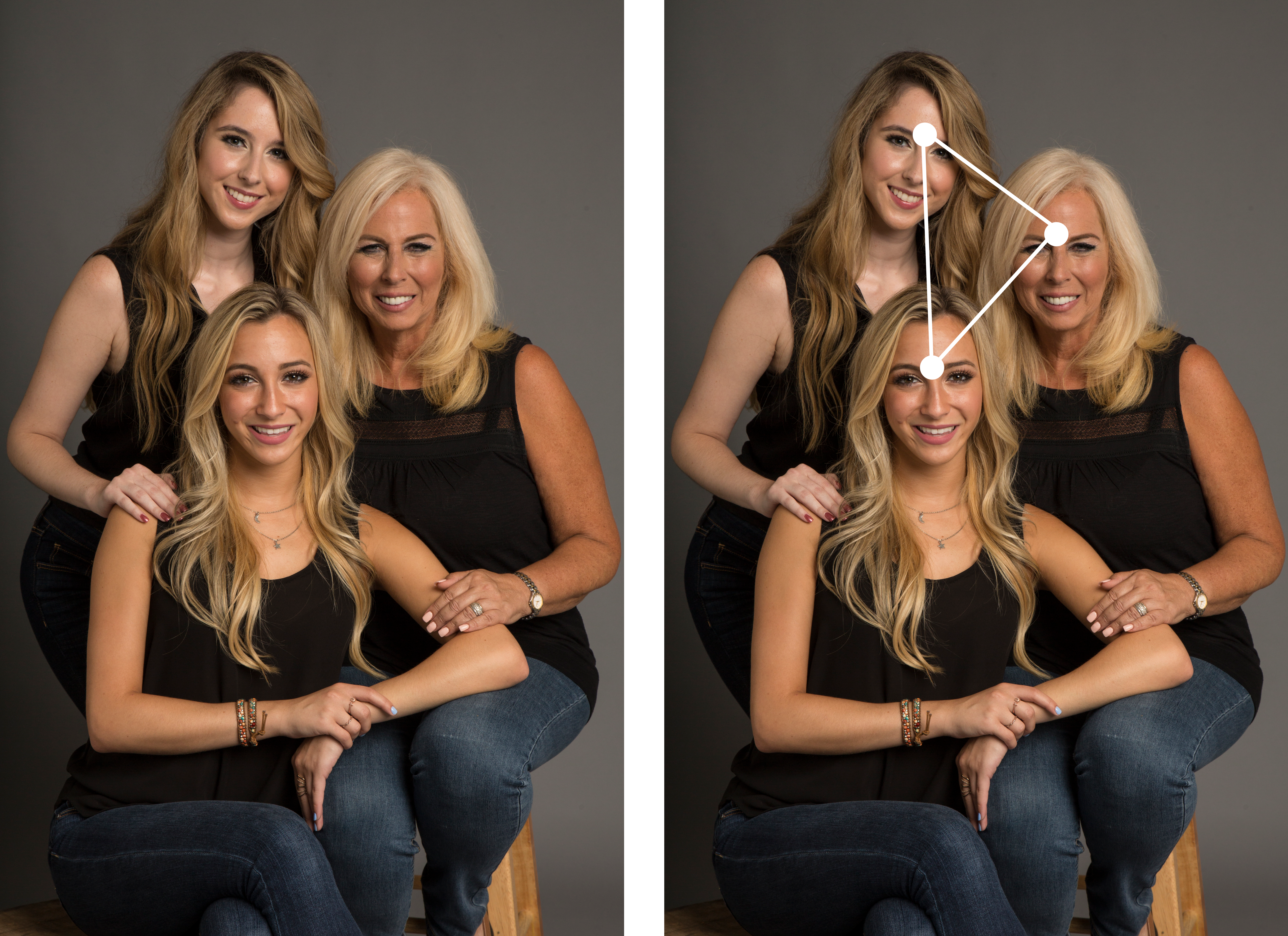
In FIGURE 9.2, I’ve made a slight adjustment to place their heads in a triangle shape. By moving the mother off to the side just a bit and repositioning the head of the standing daughter so it is lower, the shot is completely transformed. Does the triangle always need to be this defined? No. It can certainly be much more subtle than this particular composition, but you’ll typically want to stay far away from lining up the heads.

Figure 9.2 – Notice the triangle that has been created by the placement of the heads.
The same is true for lining the heads up horizontally, which is the most common mistake I see with group and family posing. Shots where everyone stands side by side may work in a small group, but in larger groups it comes across as stagnant. This is apparent in FIGURE 9.3. The heads are lined up, and the pose causes the bodies to look wider. By bringing the pose in closer and creating subtle triangles with the head placement, the pose will have improved flow and the subjects will appear more affectionate toward each other.

Figure 9.3
CAUTION With smaller family groups of three or four people, lining up the heads in a row is a little less objectionable. When you get into larger groups of four or more, the lack of compositional flow becomes a problem. Do you have a mother and two sisters whose heads you want to line up? I don’t recommend it, but it’s not a terrible photo. But when you add in more siblings, grandma, grandpa, and parents, the line-up looks like a lazy, unplanned composition.
Placing the heads in a triangle is effective with larger groups. At some point, depending on group size, this may become somewhat impractical, but it can easily be achieved with six, seven, eight, or even more people.
Let’s take a look at this concept with the entire family (FIGURE 9.4). There are triangles everywhere. Can you see and identify them? First, you can see the triangles created by the position of their heads (FIGURE 9.5). In FIGURE 9.6, not only are their heads placed to create several triangles for visual flow, but the entire pose has created a triangle composition. In short, if you are posing families, think triangles!

Figure 9.4, left. Figure 9.5, right.

Figure 9.6
This was excerpted from The Photographer’s Guide to Posing, by Lindsay Adler


